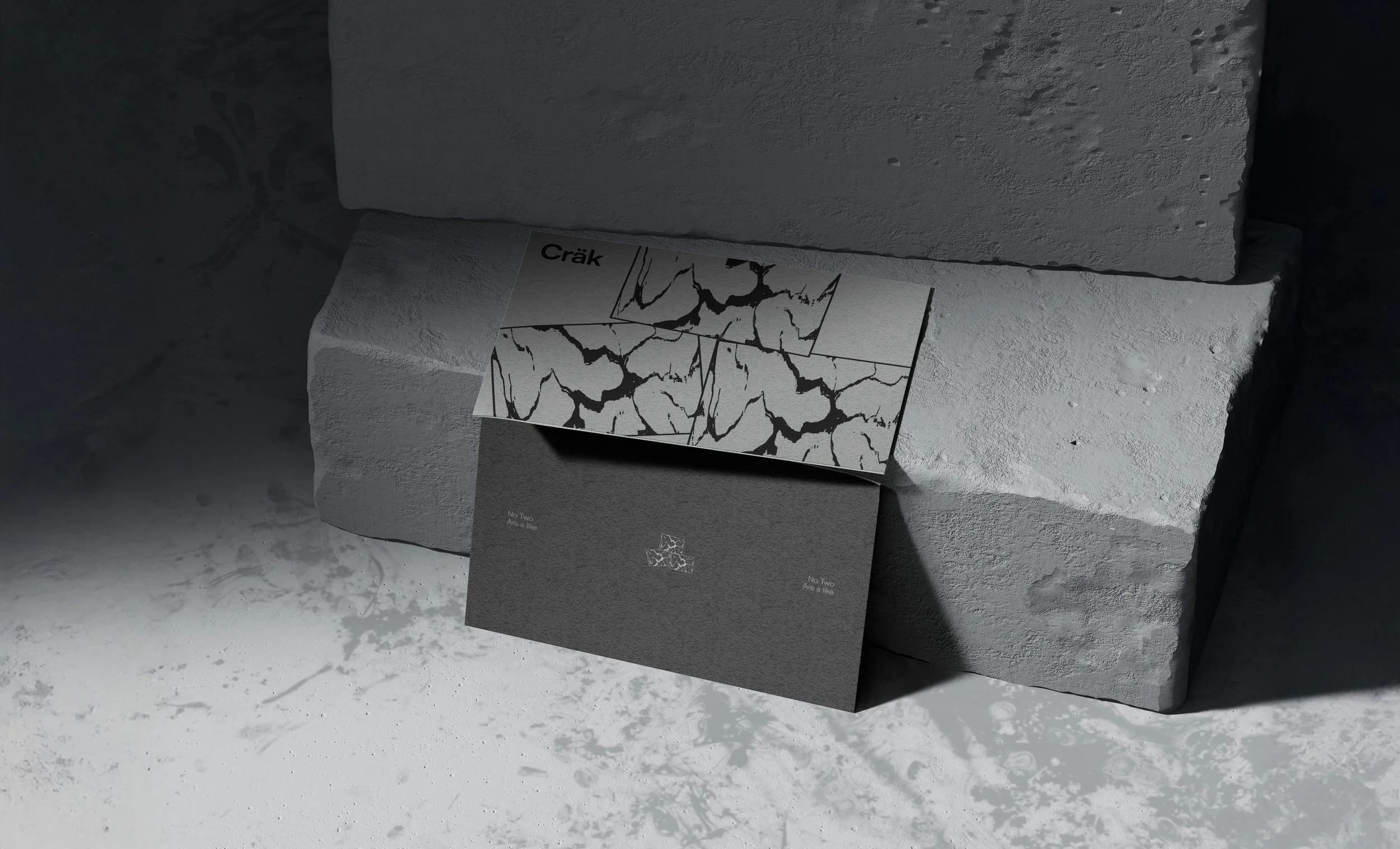
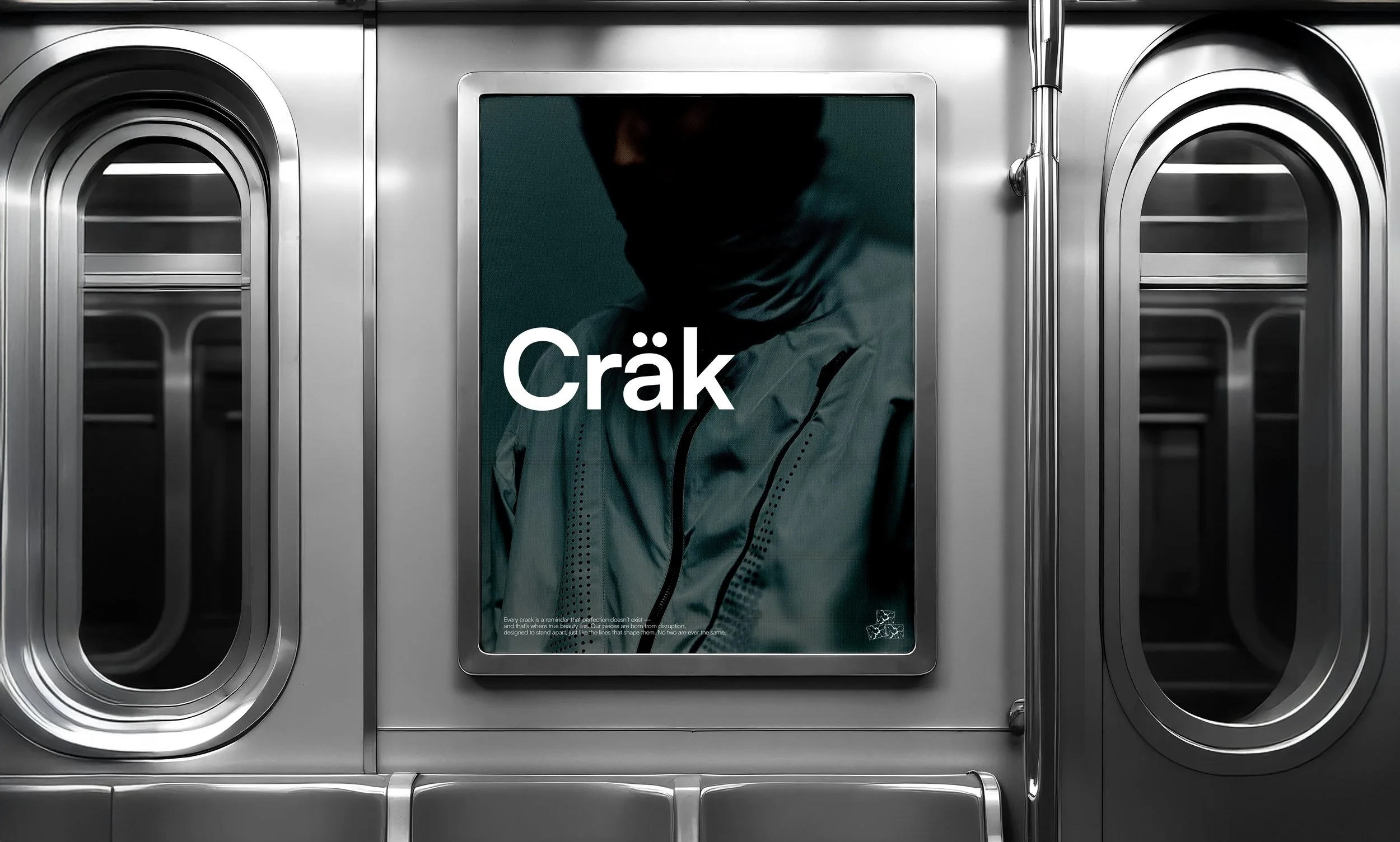
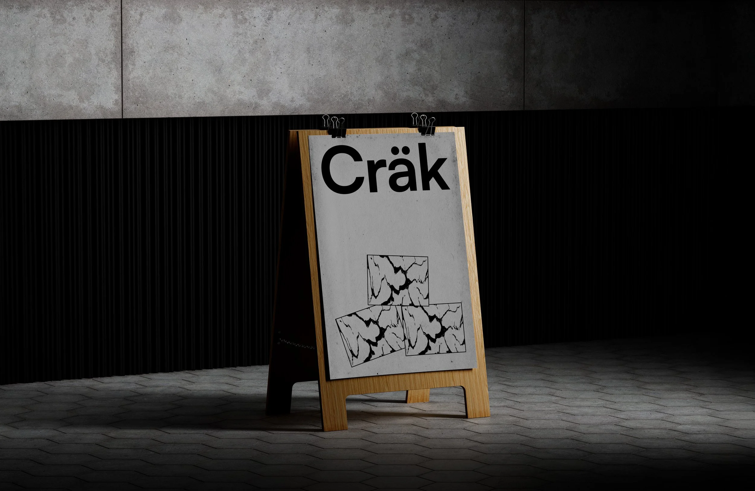
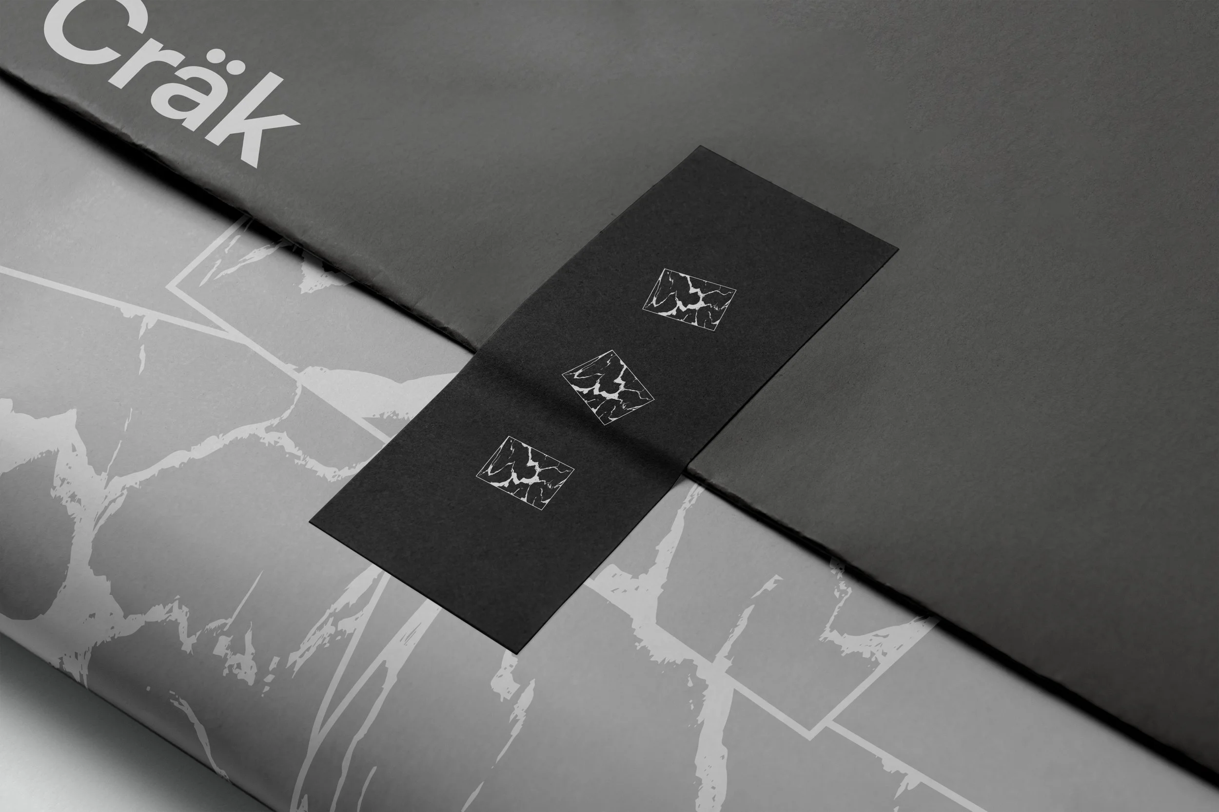
Cräk
Never the Same
Intro
Cräk is a contemporary fashion brand built on the concept of individuality—where no two pieces, moments, or people are ever alike. Inspired by the natural imperfections of cracked stone, the brand celebrates uniqueness through subtle, refined design.
Strategy
The brand’s positioning revolves around the idea of “Never the Same,” reflecting both the beauty of imperfection and the authenticity of self-expression. Cräk stands against uniformity in fashion, presenting each piece as part of a larger narrative of difference and character.
Design
The visual identity draws inspiration from three stones, each carrying its own unique cracks—symbols of individuality and distinction. The color palette is monochromatic, echoing the raw tones of concrete and natural stone. The logo features a clean sans-serif typeface with generous negative space, creating a modern and minimal aesthetic. The emblem is interchangeable, allowing the three stones to appear intertwined, separated, vertical, or horizontal—further reinforcing the idea that nothing is ever the same.
Results
Cräk’s identity achieves a delicate balance between luxury and imperfection. Through its minimalist visuals and conceptual depth, it establishes a brand that is timeless, premium, and unapologetically different—true to its core belief: Never the Same.


