Kwell
Finance, Reimagined
Intro
Kwell is a financial services brand designed for a new generation, bold, unconventional, and unapologetically different. Unlike traditional financial institutions, Kwell positions itself as agile and action-driven, ready to intervene where needed and then move on, reflecting a dynamic and youthful approach to finance.
Strategy
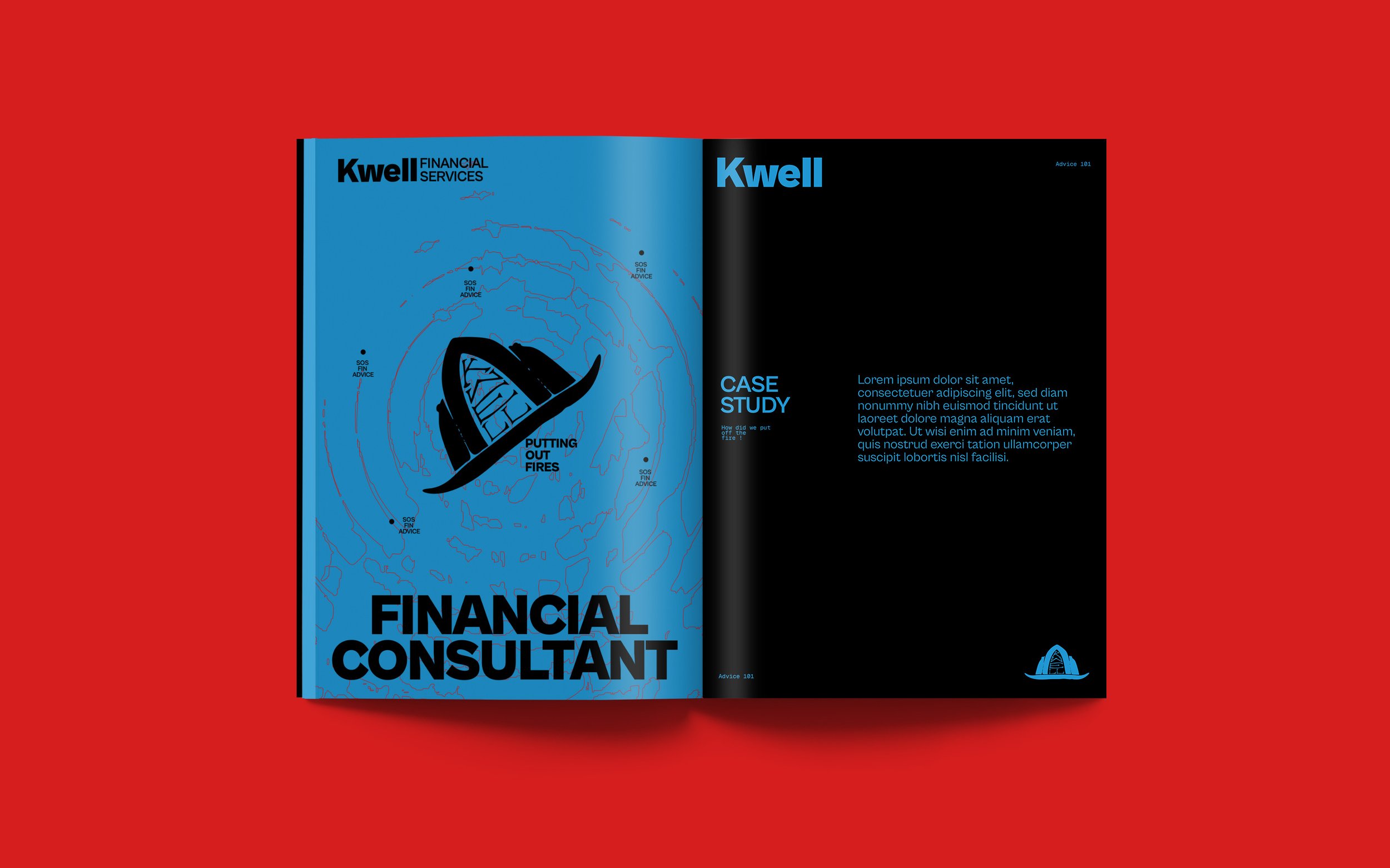
The concept draws inspiration from firefighters: ready to step in, handle critical situations, and leave the scene stabilized. Kwell’s strategy focuses on conveying speed, decisiveness, and disruption in the financial sector. The brand targets young audiences who value creativity, innovation, and a sense of purpose beyond conventional financial norms.
Design
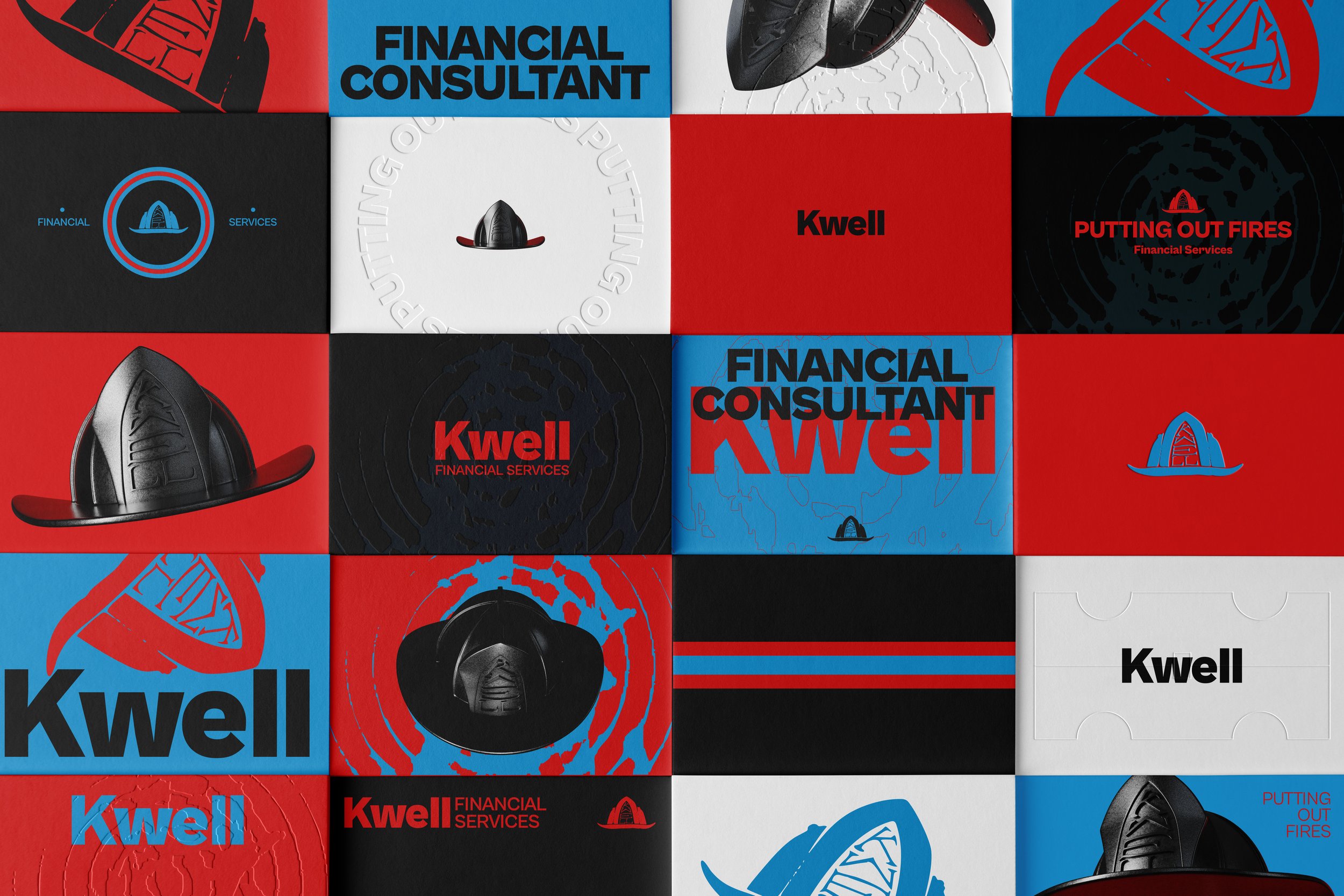
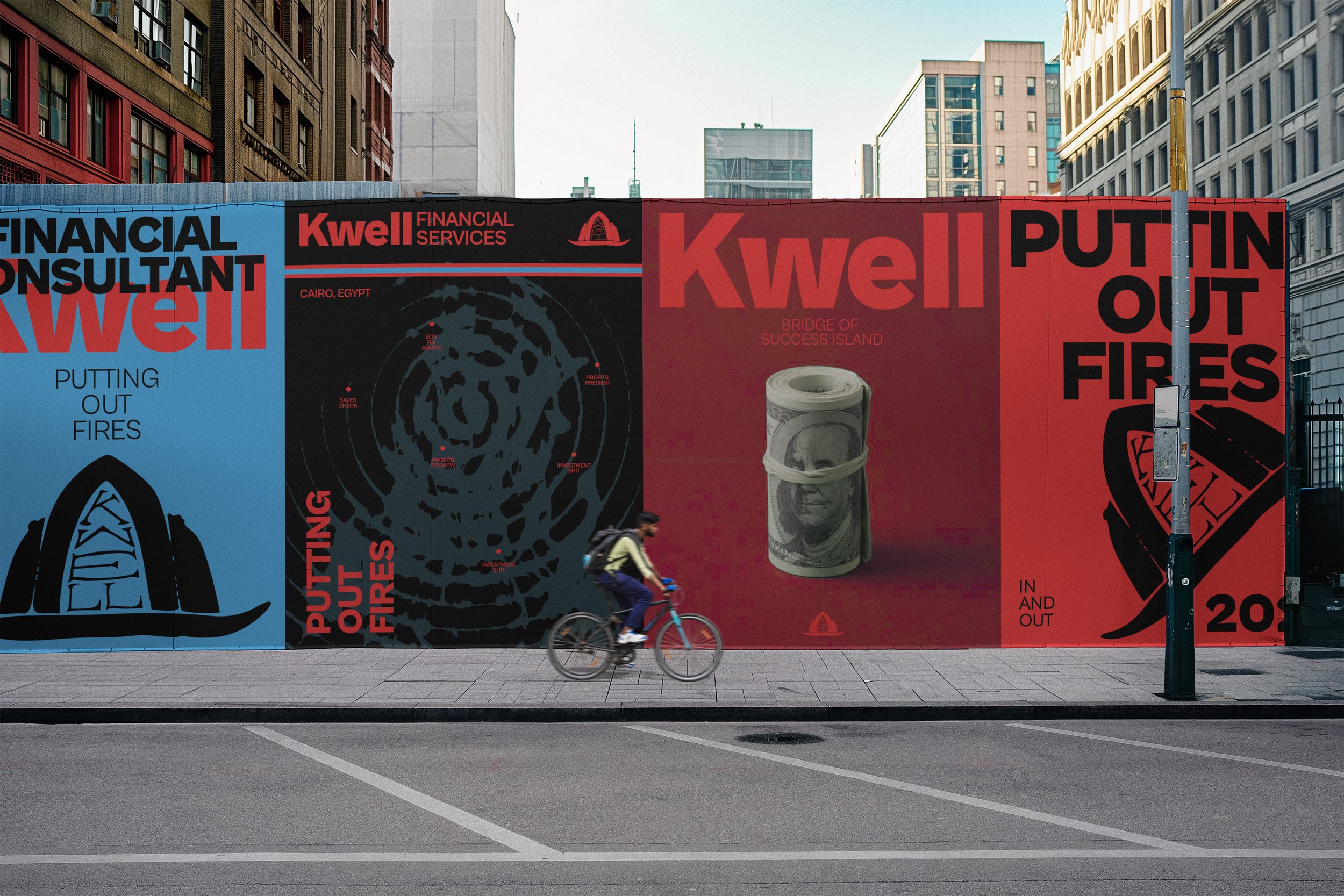
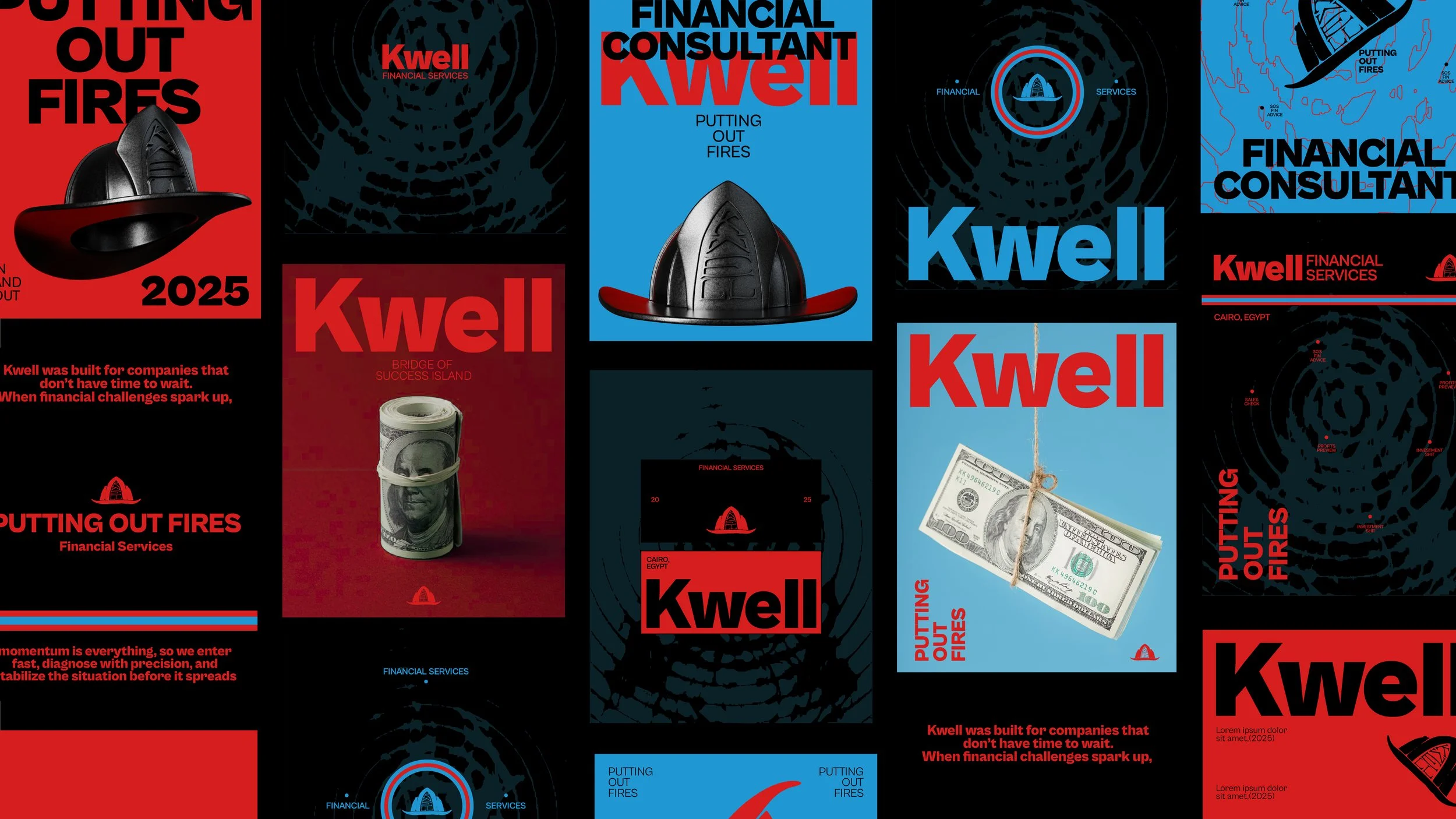
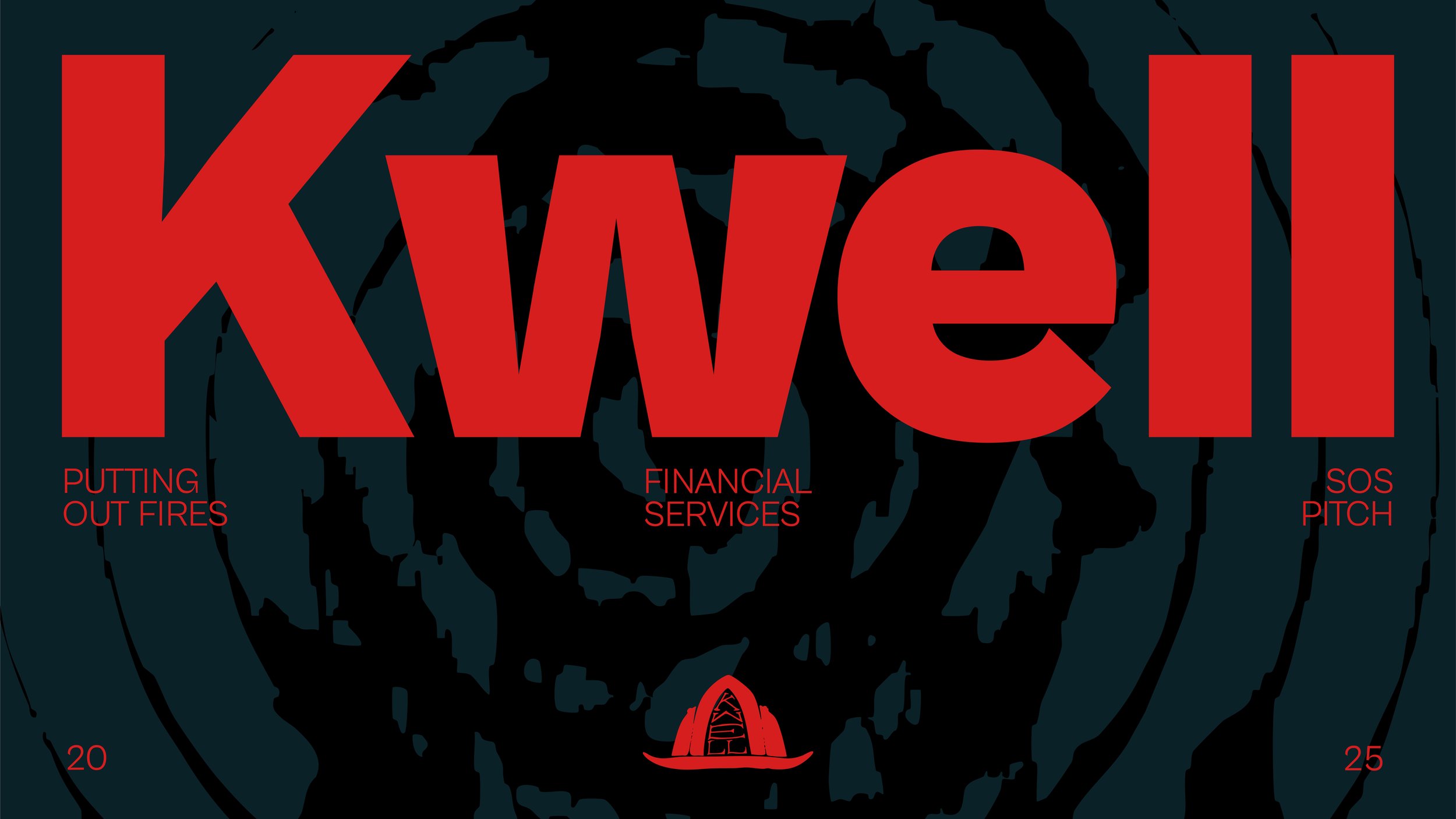
The visual identity revolves around a firefighter’s cap as the primary icon, rendered in both 2D and 3D to create depth and versatility. The color palette, black, red, teal, and light blue, symbolizes the duality of fire and water, echoing the firefighting concept. Typography is clean and modern, supporting the bold, contemporary aesthetic. Patterns and layouts draw on the interplay of water and fire, incorporating abstract mapping reminiscent of firefighting plans, further reinforcing the brand story.
Results
Kwell’s identity communicates action, reliability, and youthful energy while standing apart from traditional financial brands. The combination of strong visual storytelling, distinctive colors, and thematic patterns creates a disruptive yet cohesive brand that resonates with young, idea-driven audiences.
