Klon
Precision in Every Detail
Intro
Klon is a dental clinic whose name is inspired by the word clone, reflecting its commitment to replicating natural teeth with exceptional accuracy and care. The brand needed to communicate purity, professionalism, and a sense of safety, creating an environment where patients feel calm, confident, and well taken care of.
Strategy
The branding focuses on clarity, cleanliness, and trust. White negative space becomes a central element, symbolizing the natural spacing and purity associated with healthy teeth. The strategic direction aims to position Klon as an advanced, reliable, and aesthetically refined clinic that blends medical precision with a modern, reassuring experience.
Design
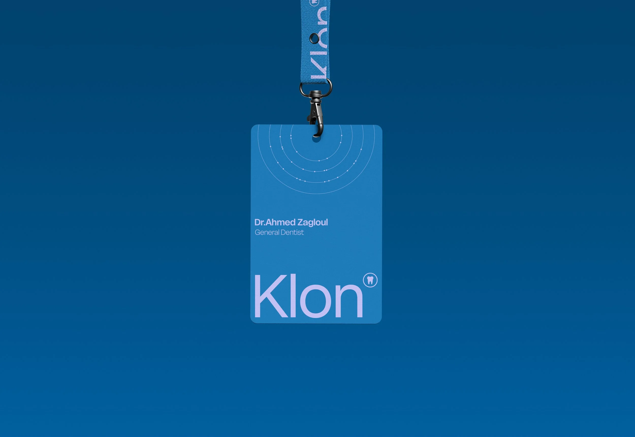
A clean, modern sans-serif typeface sets the tone for professionalism and simplicity. The color palette uses blue to convey trust and safety, balanced with light purple to introduce a subtle twist that differentiates Klon from typical dental brands. The emblem is a minimal tooth—clear, recognizable, and strong enough to stand alone without additional descriptors. To deepen the visual story, we added thin lines and dots inspired by orthodontic systems: the lines represent wires and the dots symbolize brackets, echoing alignment, precision, and replication. This combination of minimal forms reinforces the concept of creating natural, precise, “cloned” teeth while keeping the identity light and airy.
Results
Klon’s visual identity achieves a refined balance of medical trust and modern distinction. It feels clean, minimal, and memorable, clearly expressing the clinic’s ability to replicate natural teeth with precision. The system is calm yet distinctive, positioning Klon as a professional, innovative, and patient-centered dental clinic.


