Introduction
Jijonenca is a renowned Spanish ice cream brand that was in need of a complete rebrand to overcome outdated visuals and an unclear communication strategy. The mission of the project was to breathe new life into the brand while honoring its legacy and emotional connection to generations of families in Spain.
Strategy
We repositioned Jijonenca around a universal truth: ice cream is joy, nostalgia, and a portal to childhood memories. The brand’s new purpose is to remind everyone, regardless of age, that fun, warmth, and playfulness should always be part of life. The central brand claim: “For the kid in all of us.”
Design
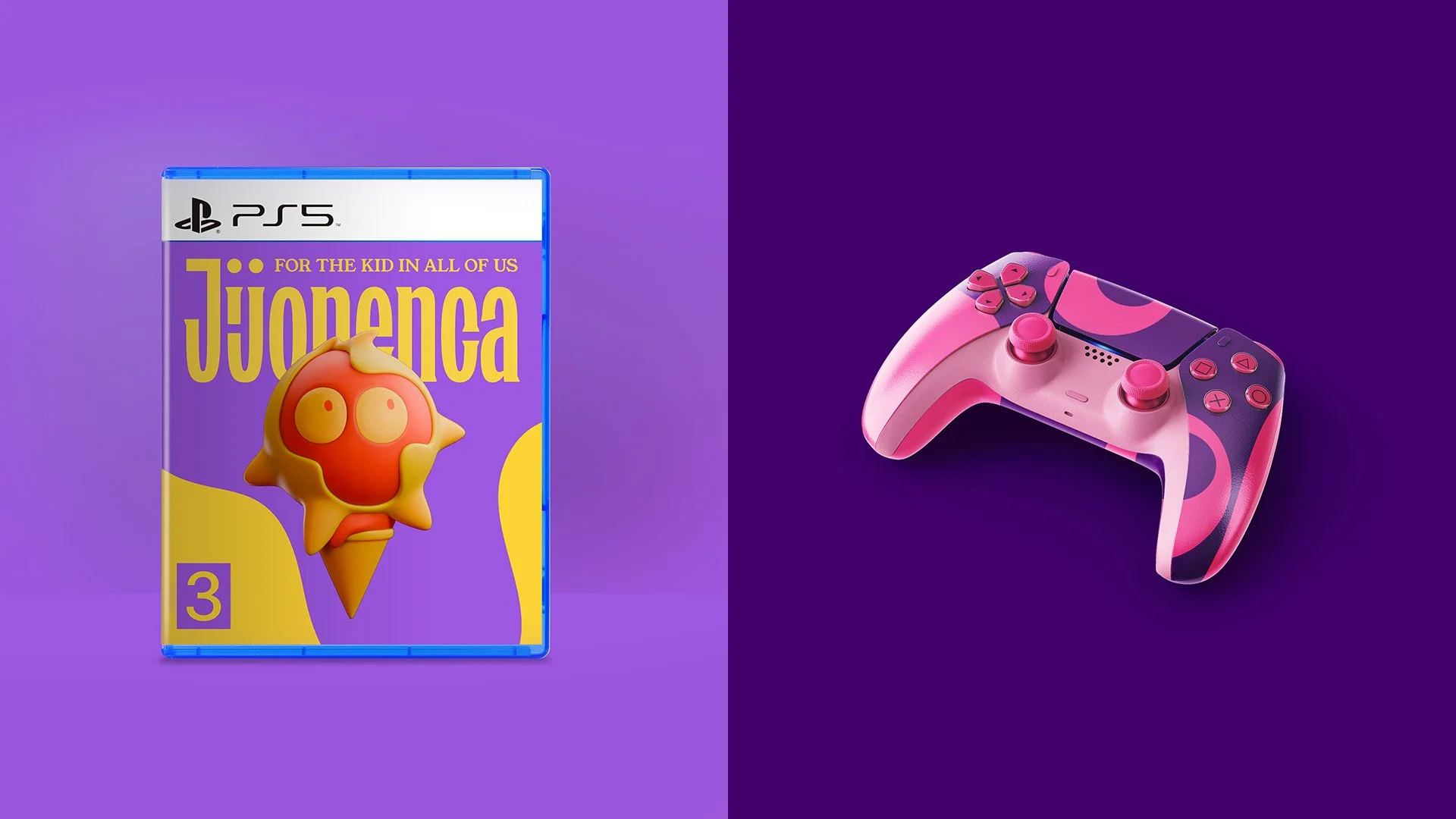
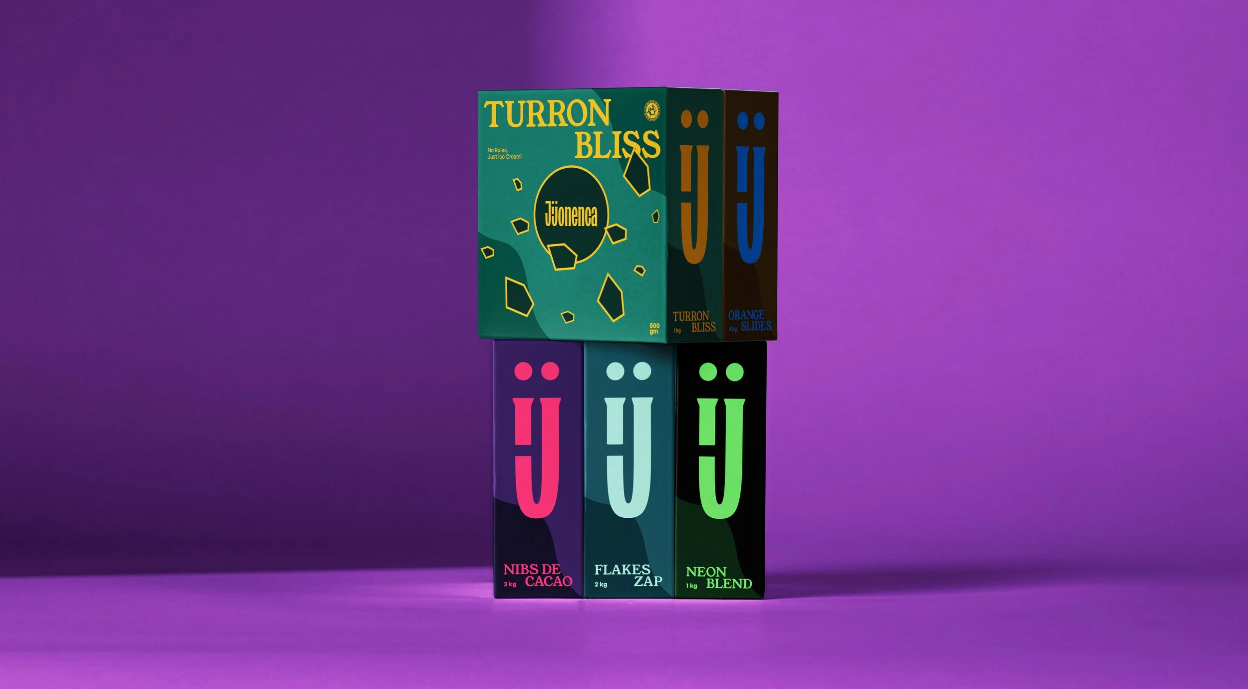
Visually, the brand embraces vibrant, playful colors paired with a modern typeface, subtly mixed with serif elements to reflect its Spanish roots. The highlight of the branding is a custom mascot, cheerful, with wide playful eyes made of colorful scoop-like balls. The mascot is designed to be versatile, appearing in multiple versions and even evolving into 3D toys and plush figures, building a full playful universe around Jijonenca. Everything, from packaging to signage, feels like entering a world of toys, happiness, and shared memories.
Results
The rebrand successfully transformed Jijonenca into more than just an ice cream brand, it became a world of fun, nostalgia, and emotional connection. The updated identity bridges generations, creating a recognizable, playful, and modern brand that feels as much like a beloved toy store as an ice cream parlor.
(A self-initiated rebranding exploration, created as a conceptual exercise independent of the official Jijonenca brand)