Intro
Lant Dental Clinic is a contemporary dental brand built around precision, trust, and the art of replication. Inspired by the concept of implants and the idea of recreating what feels completely natural, LANT represents a modern approach to dentistry where technology and comfort work in harmony.
Strategy
The strategic direction focused on positioning LANT as a clinic that masters the science of replication — perfectly restoring natural teeth with accuracy and care. The brand language balances clinical professionalism with emotional reassurance, creating a sense of safety and clarity. Every touchpoint was designed to feel clean, calm, and quietly confident, reflecting the clinic’s high level of precision and expertise.
Design
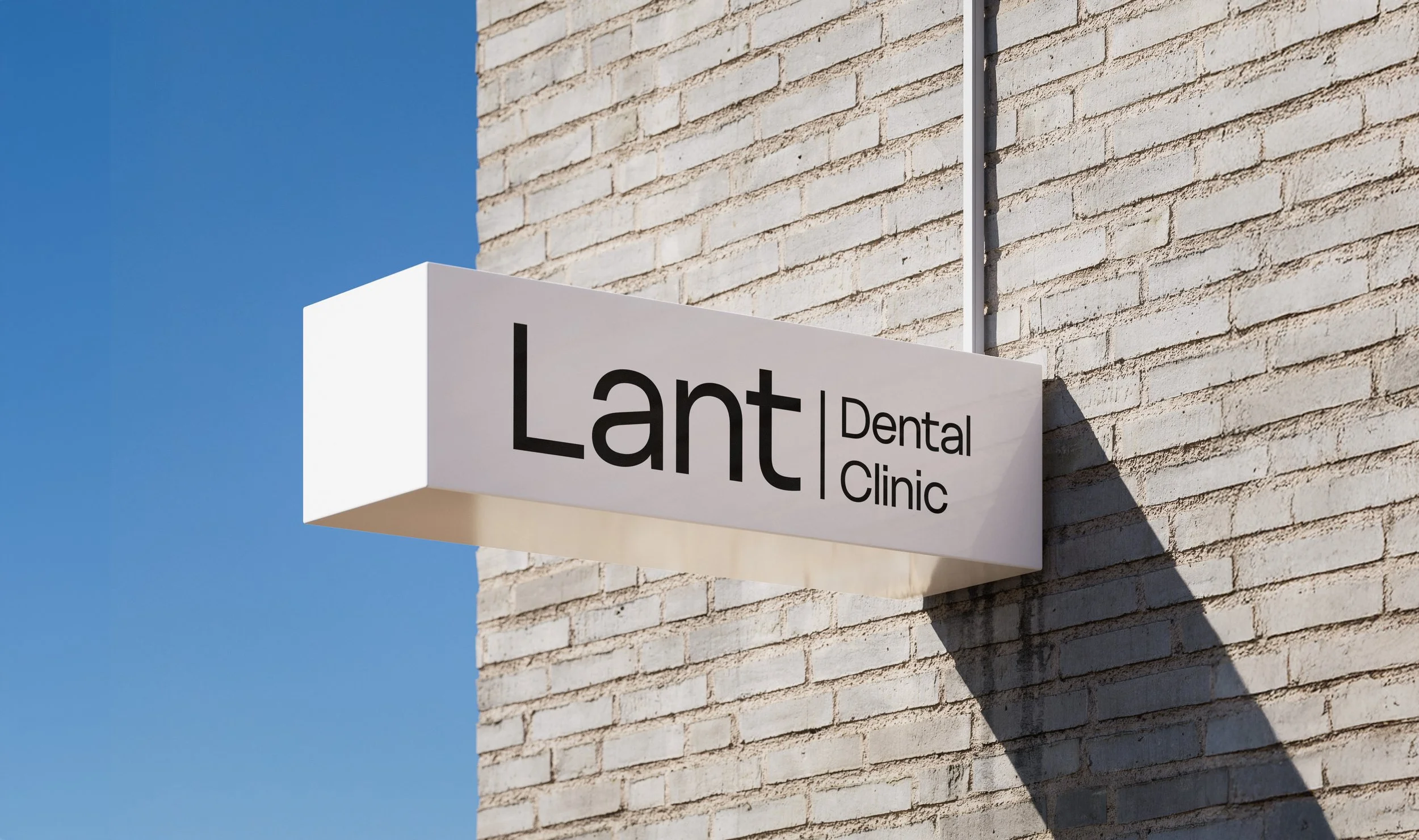
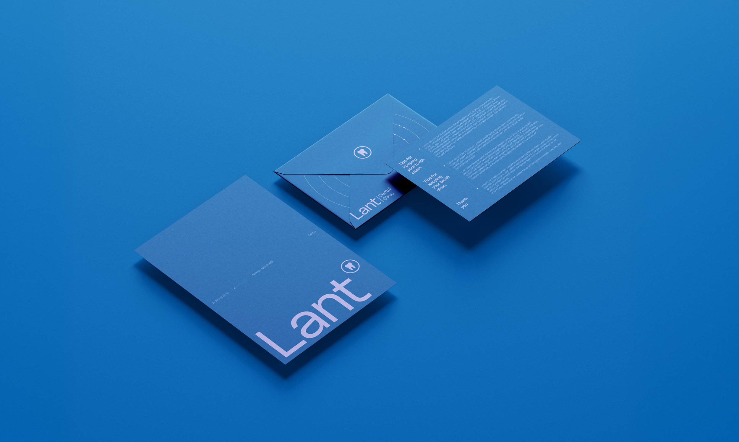
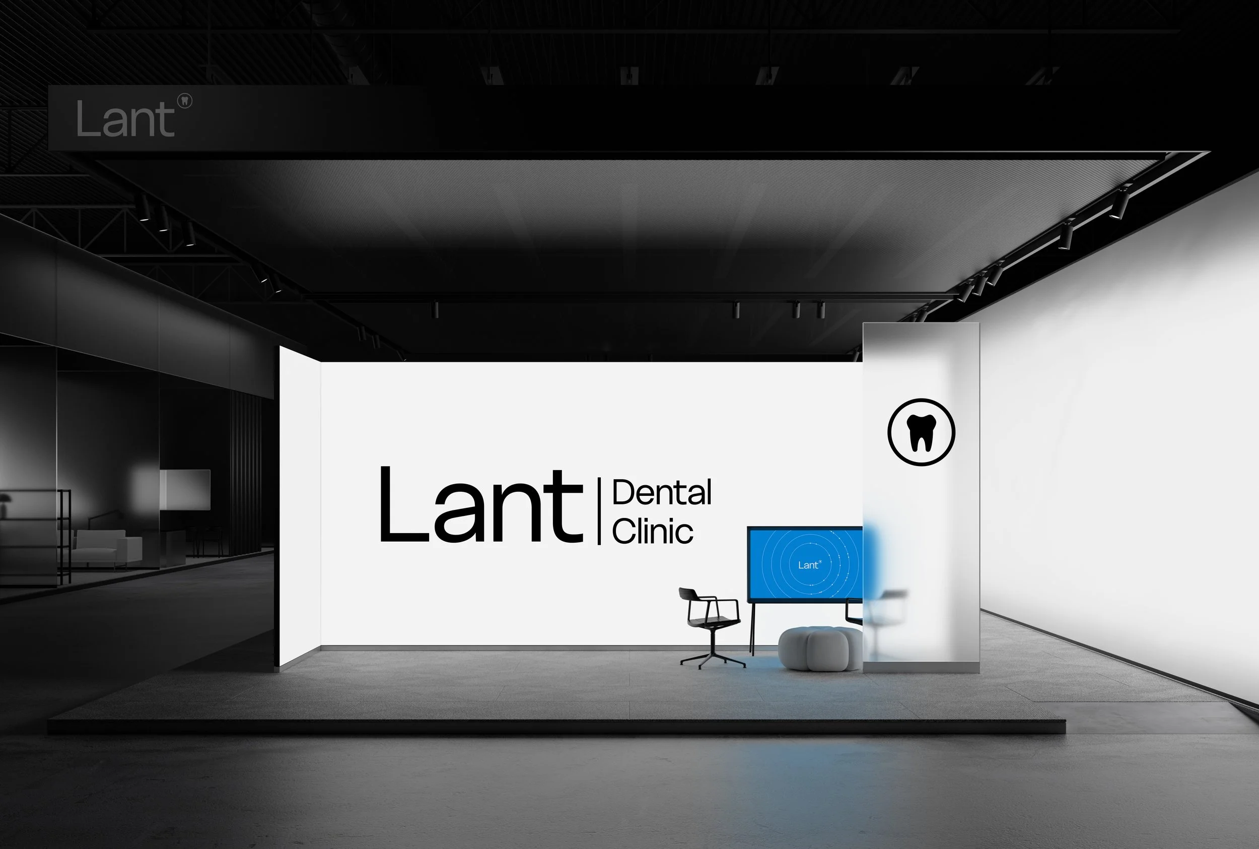
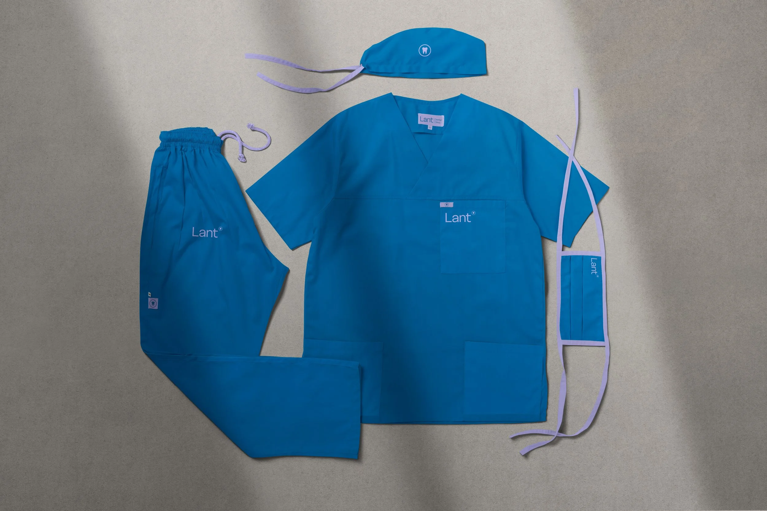
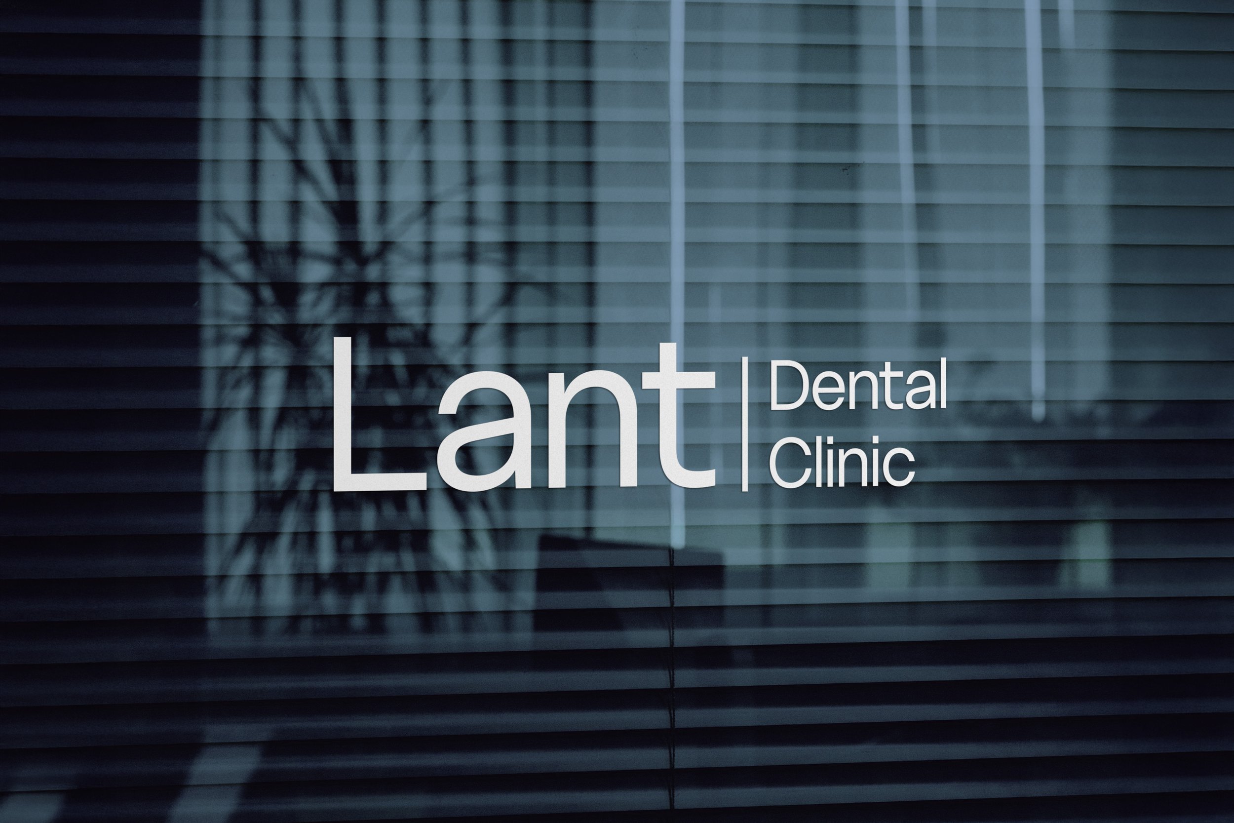
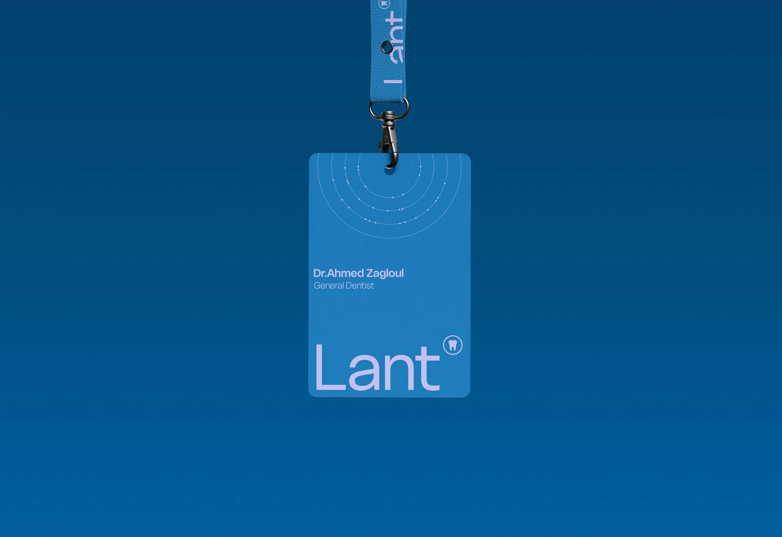
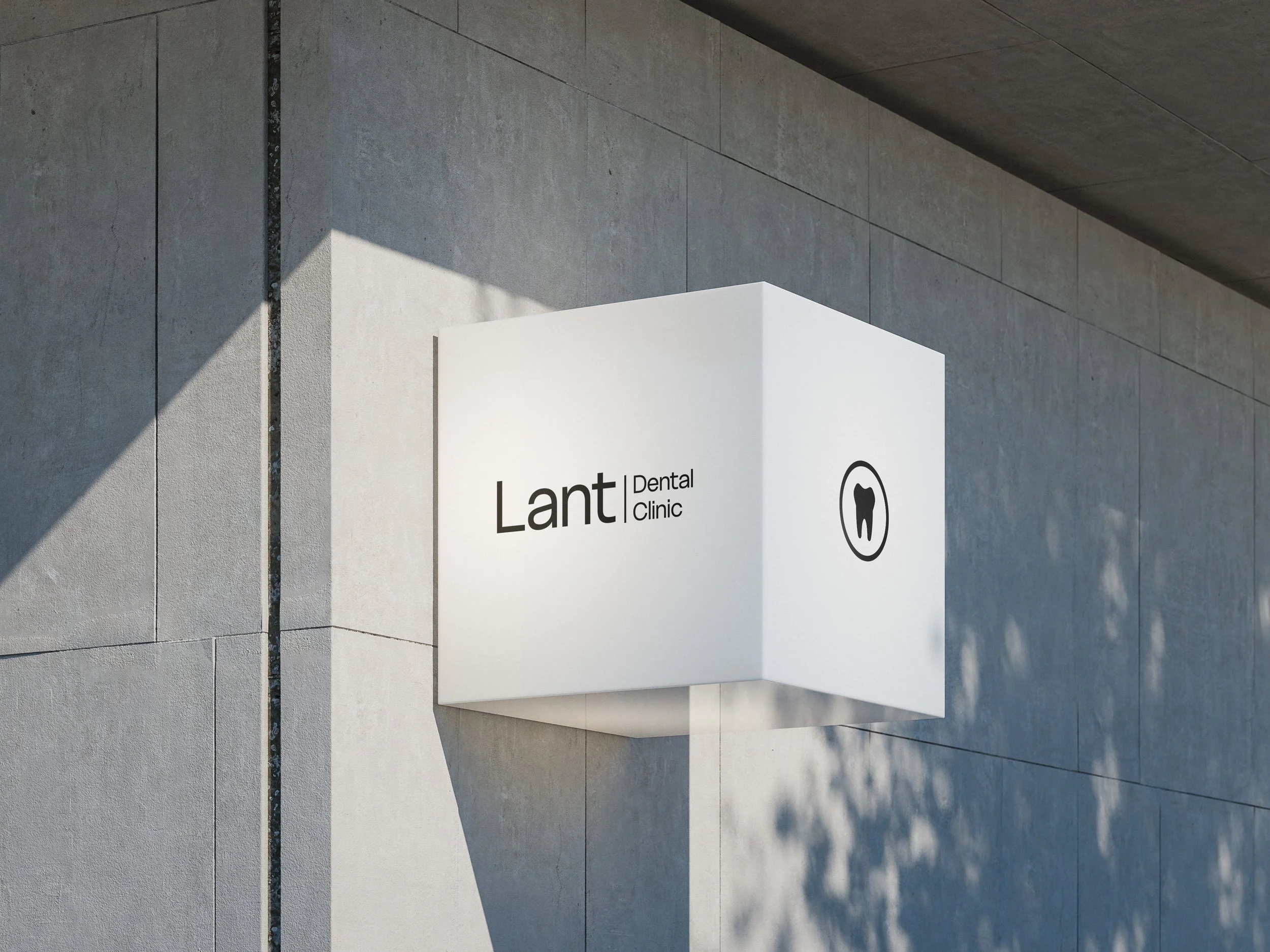
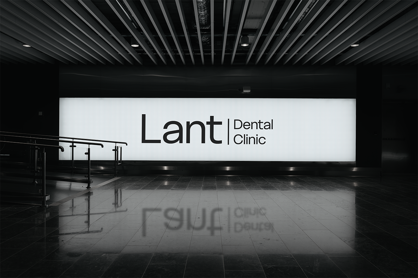
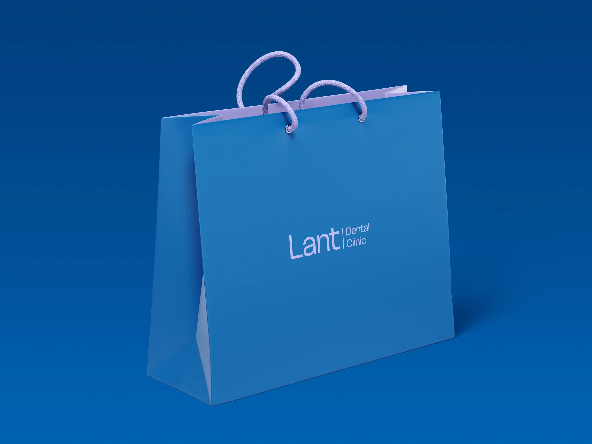
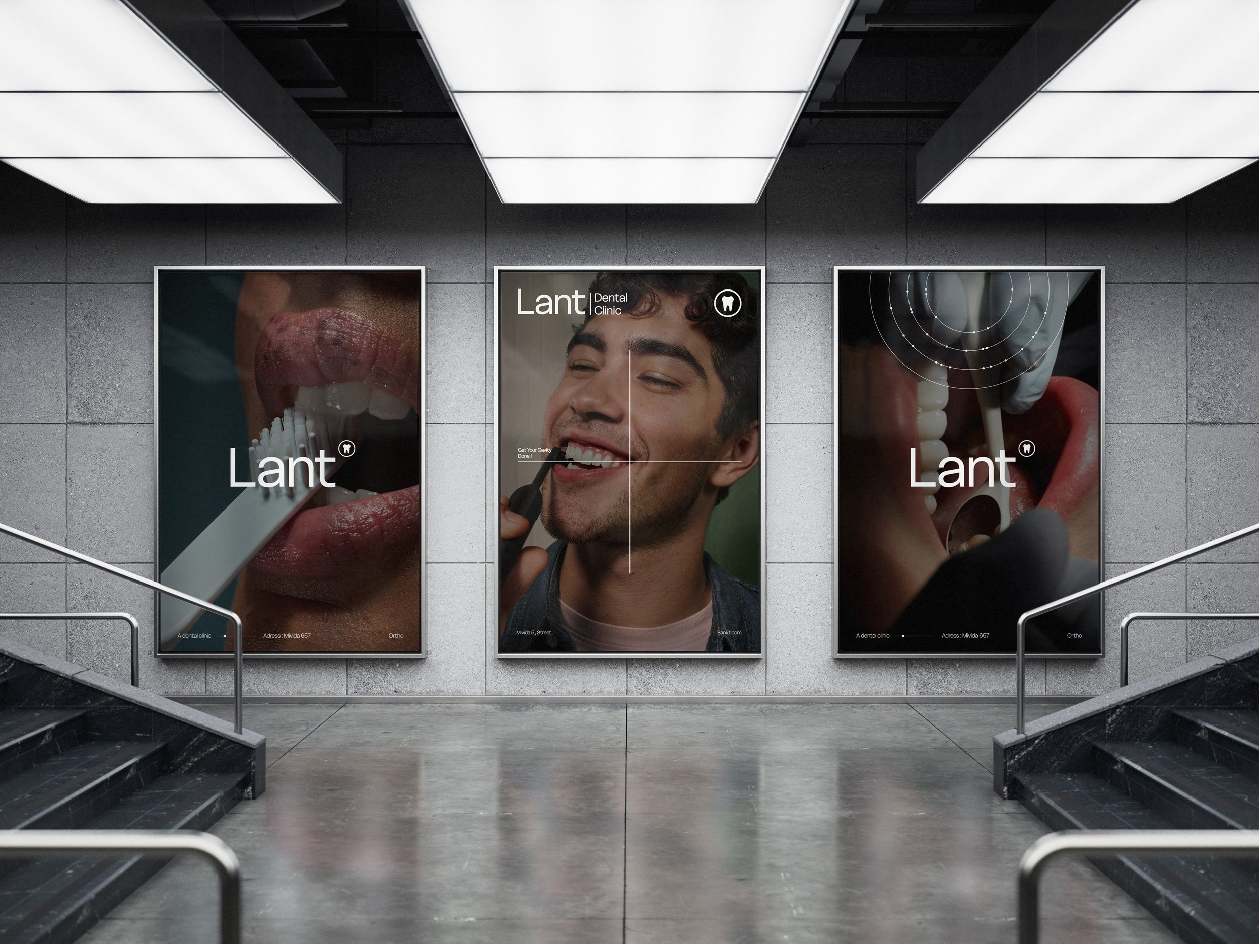
The visual identity is built around white negative space, symbolizing natural teeth and purity. A minimal tooth emblem ensures immediate recognition, even without descriptive text. Ultra-thin linear systems and dotted elements were introduced, inspired by orthodontic wires and brackets, representing alignment, structure, and precision. The typography is a modern sans serif, ensuring clarity and cleanliness, while the primary palette of blue and light purple brings together trust, safety, and a subtle sense of differentiation. The overall system is highly minimal, medical in tone, and designed to make patients feel calm, safe, and confident.
Results
The branding positioned Lant Dental Clinic as a recognizable, modern dental identity with a strong balance of professionalism and memorability. The system proved highly adaptable across digital and physical touchpoints, allowing the clinic to communicate trust, precision, and innovation consistently while standing out in a saturated market.