Intro
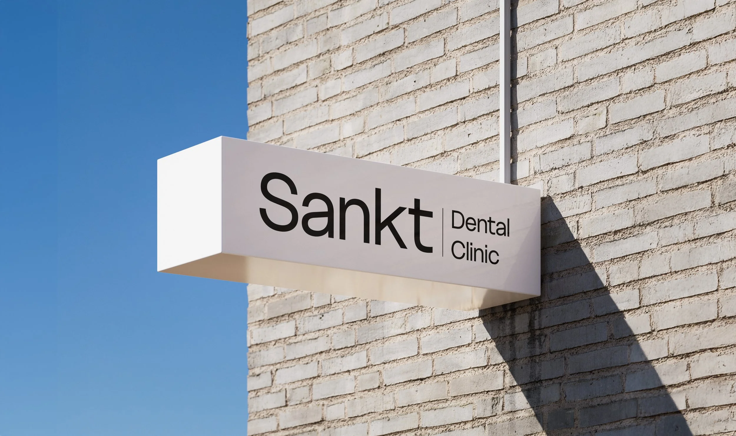
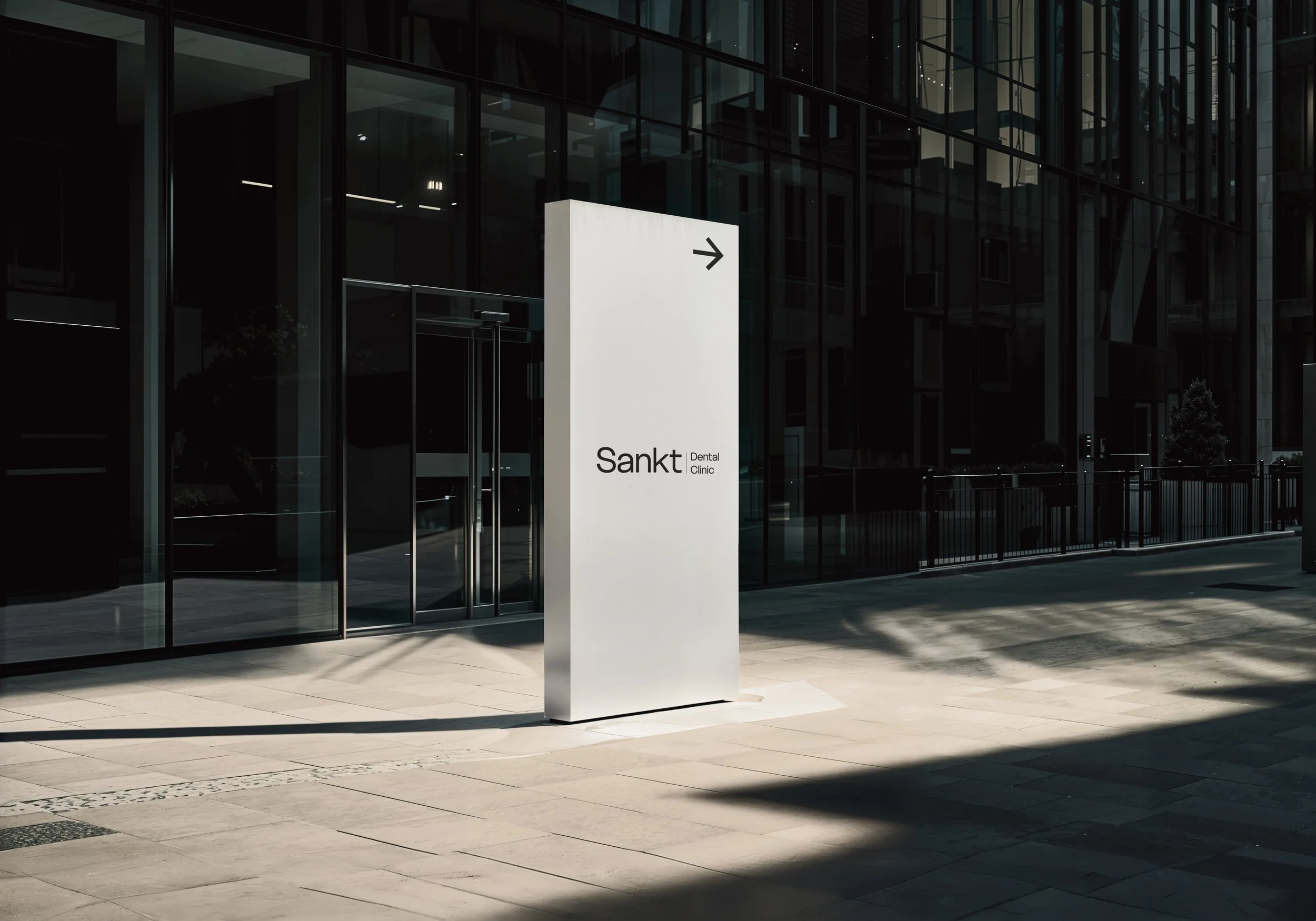
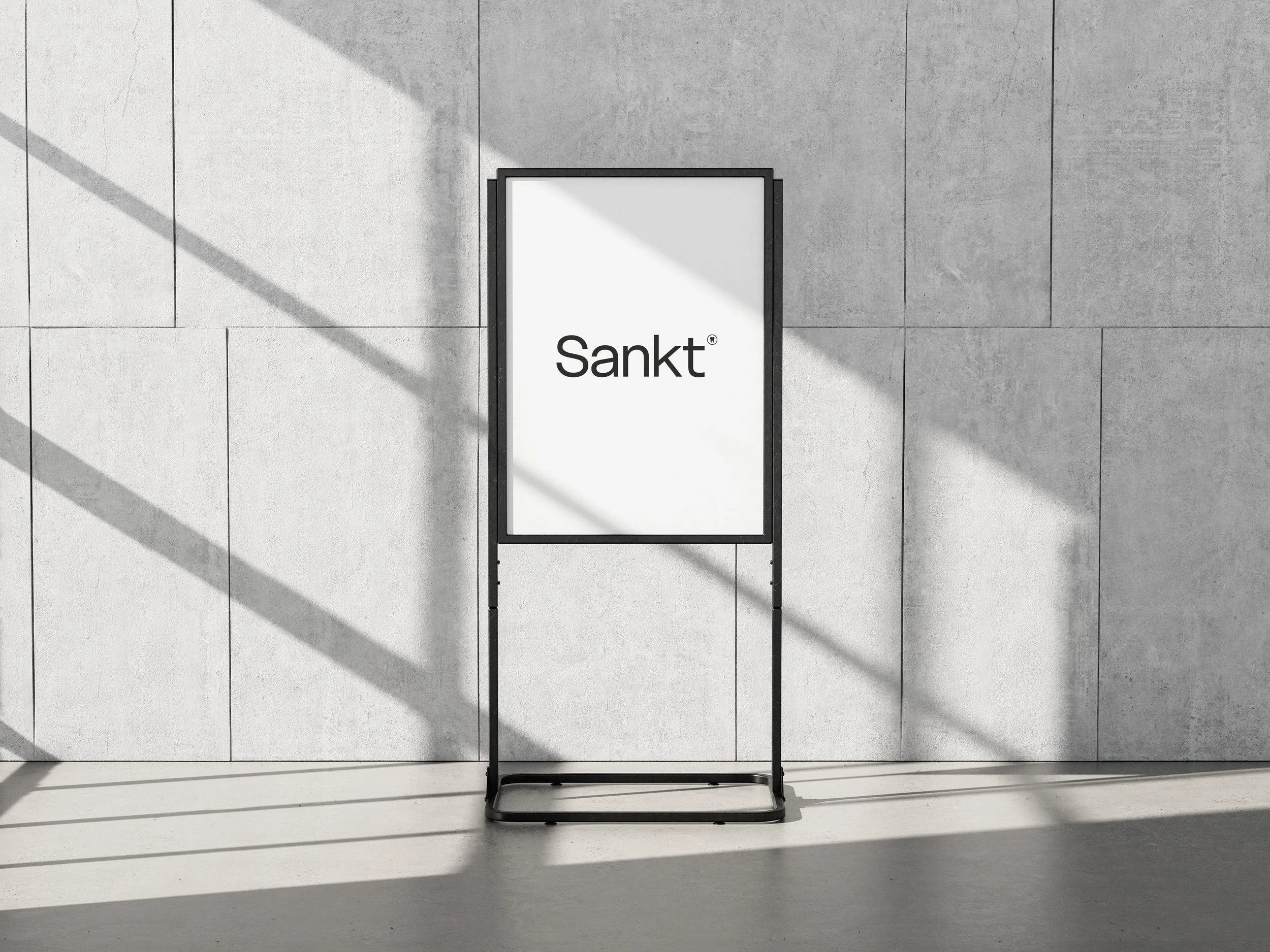
Sankt is a dental clinic brand inspired by the word sanctuary—a place of purity, safety, and sacred care. The name reflects the clinic’s promise: to make patients feel at ease in an environment that is both professional and welcoming.
Strategy
The branding was designed to highlight clarity, trust, and minimalism. White negative space mirrors the natural spacing of teeth, symbolizing both cleanliness and precision. The strategy centered on making patients feel safe, calm, and confident while introducing a subtle uniqueness that sets Sankt apart in a crowded healthcare market.
Design
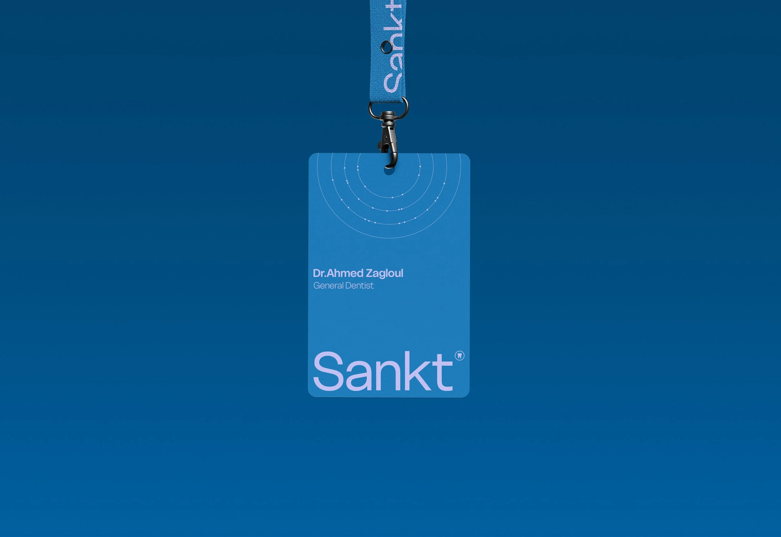
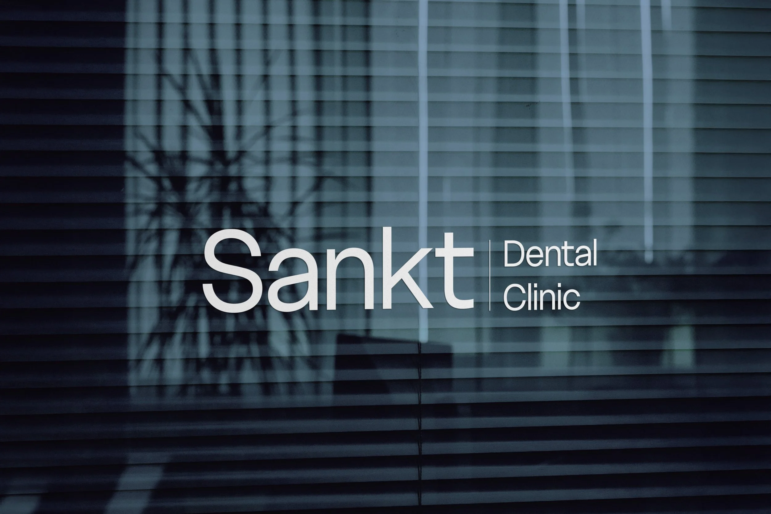
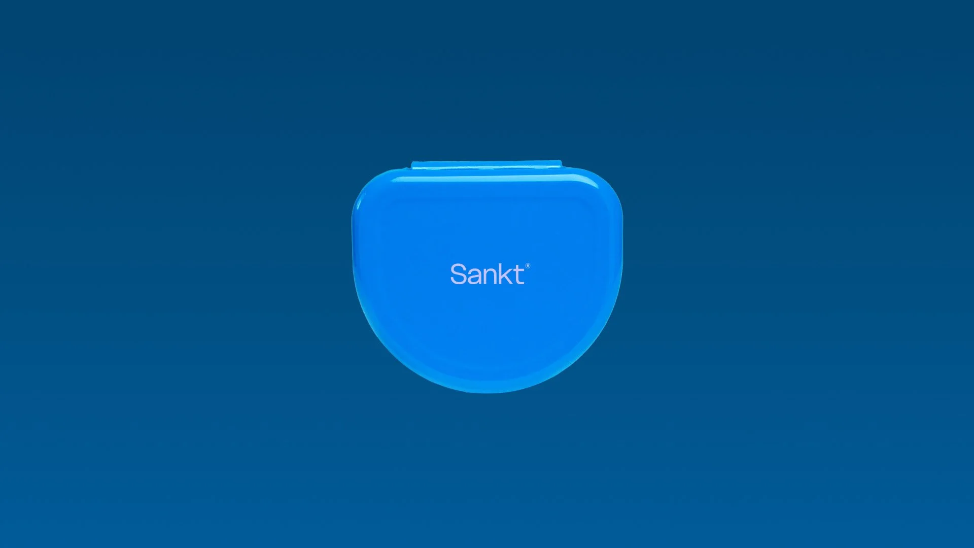
A modern sans-serif typeface ensures clarity and professionalism, while the color palette of blue and light purple establishes both trust and individuality. Blue communicates safety and reliability, while light purple adds a refreshing, distinctive twist. The emblem—a minimal tooth—instantly communicates the clinic’s specialization. To enrich the system, we incorporated very thin lines and dots inspired by orthodontic treatment: the lines resemble wires, while the dots represent brackets, symbolizing alignment and precision. Together, these details enhance the clean aesthetic while tying directly to the dental profession.
Results
The outcome is a cohesive identity that balances professionalism with approachability. Sankt’s branding projects a trusted medical image while offering a fresh, differentiated feel, ensuring patients recognize it as both a sanctuary for care and a modern, memorable clinic.