Ryda
The Ride Never stops
Intro
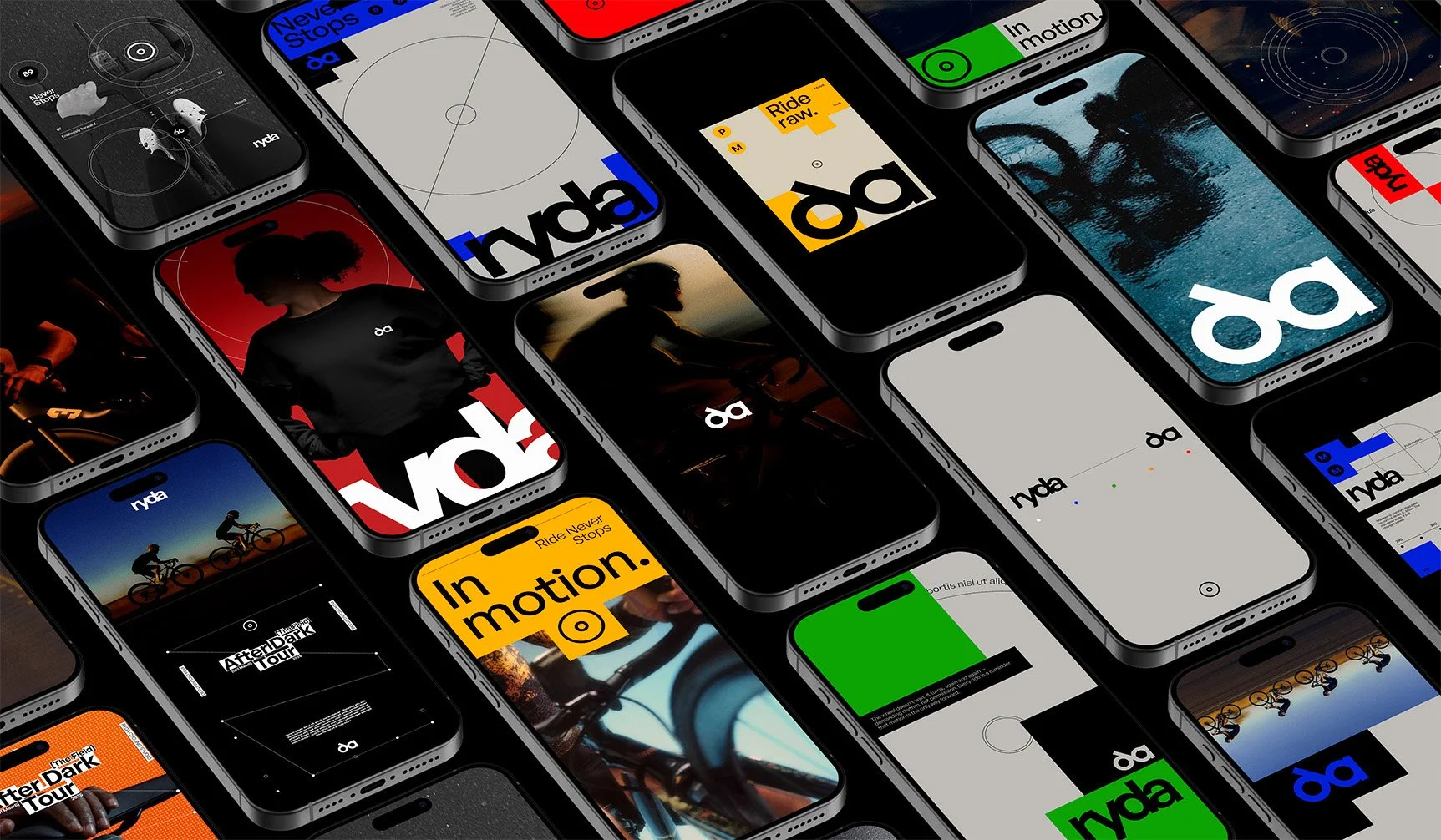
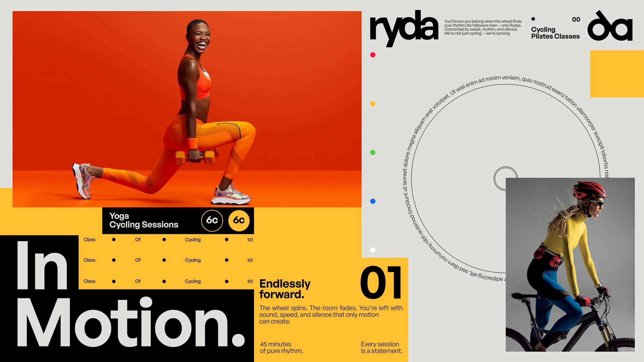
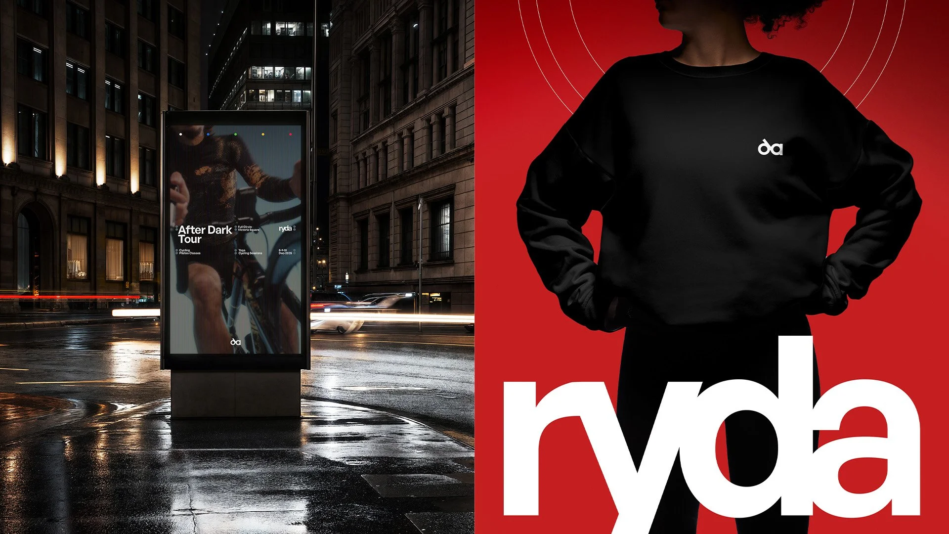
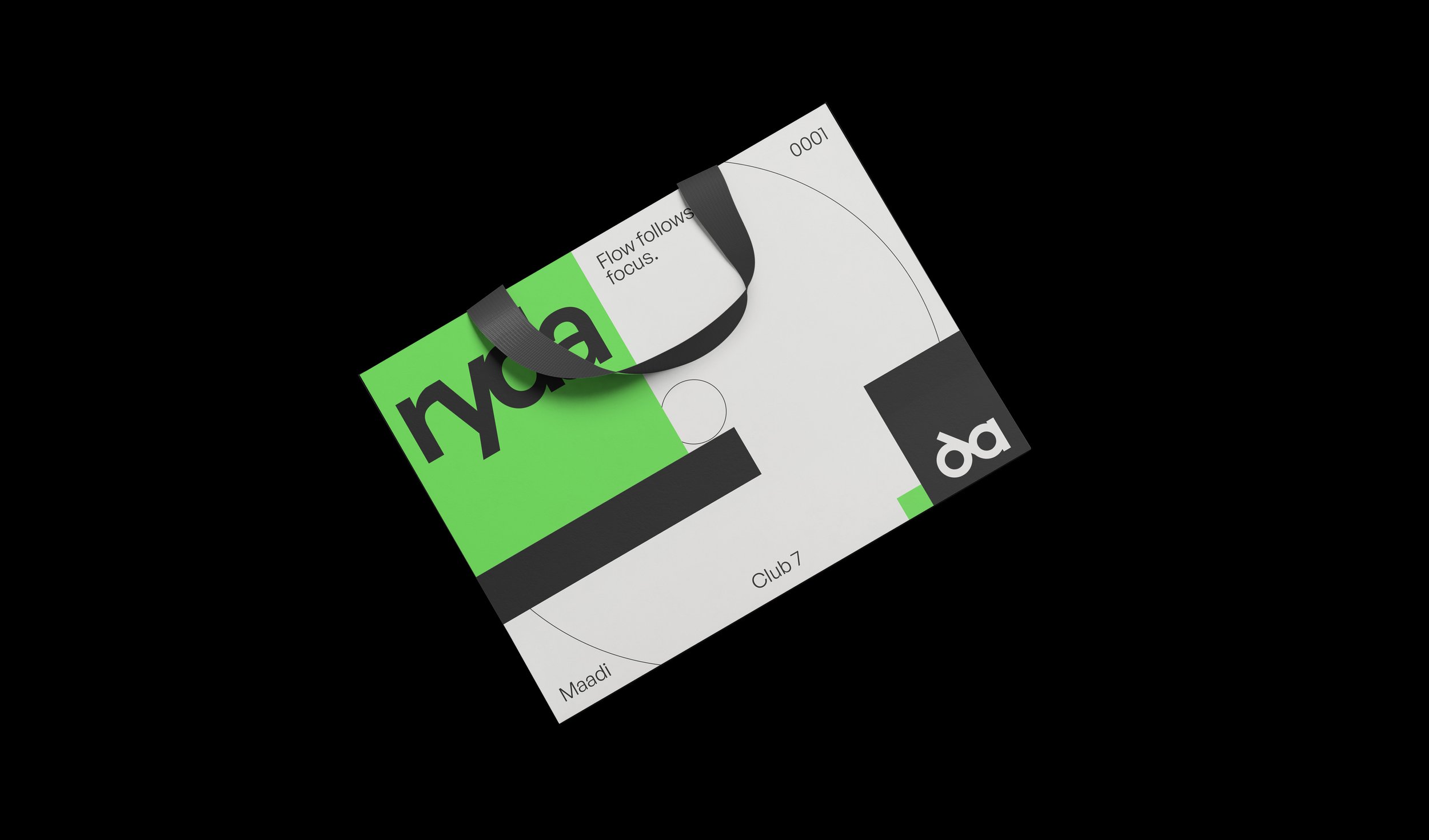
Ryda is a cycling studio brand built around the essence of motion and precision. The identity captures the rhythm of cycling, circular, fluid, and focused, translating that energy into a modern, minimal, and technical visual system.
Strategy
The goal was to create a brand that feels dynamic yet controlled, reflecting both the intensity and the elegance of cycling. Every element of the branding had to echo motion, energy, and balance, while maintaining a premium, futuristic aesthetic that stands out in the fitness market.
Design (CO-DESIGNED WITH NABEELA ROSHDY)
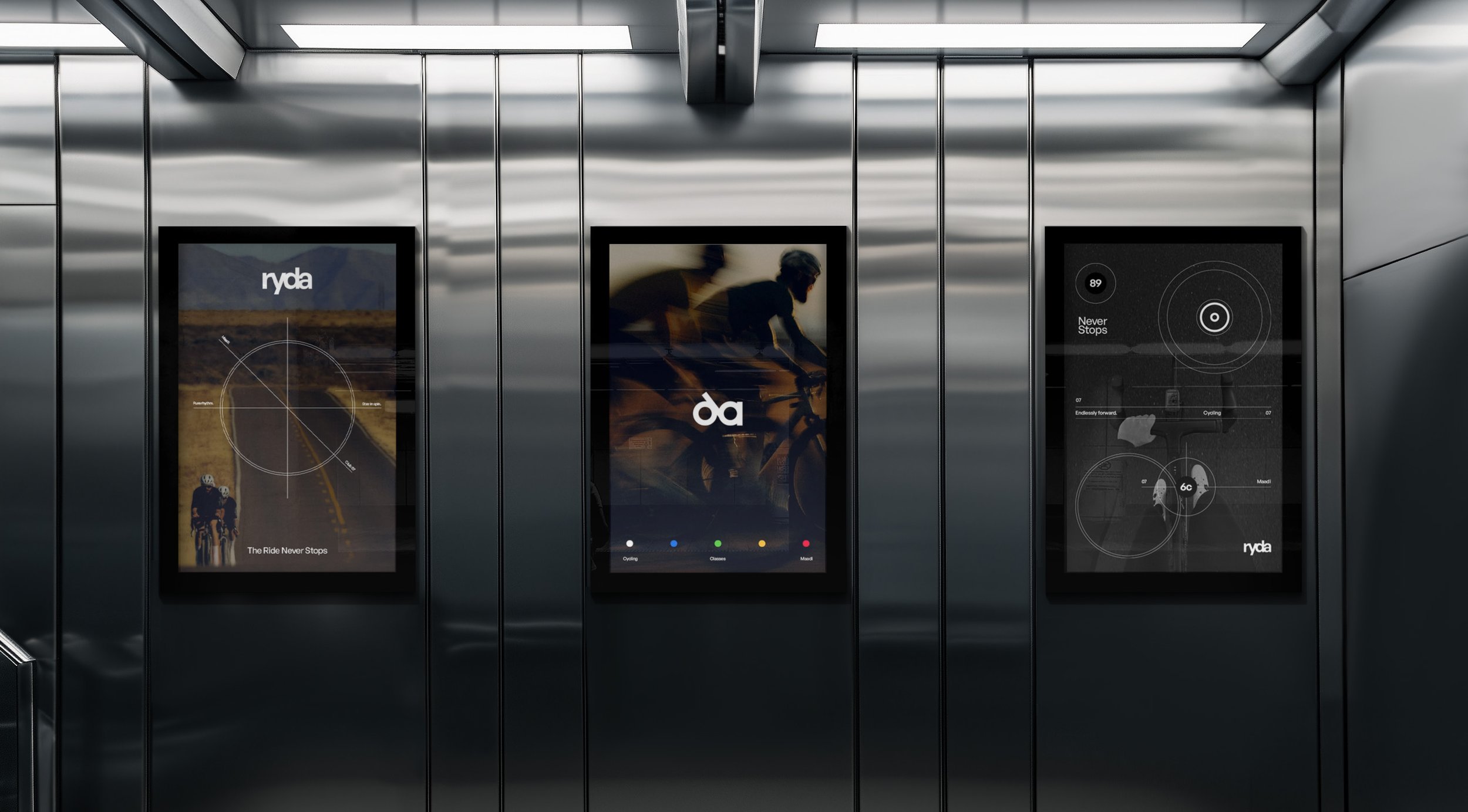
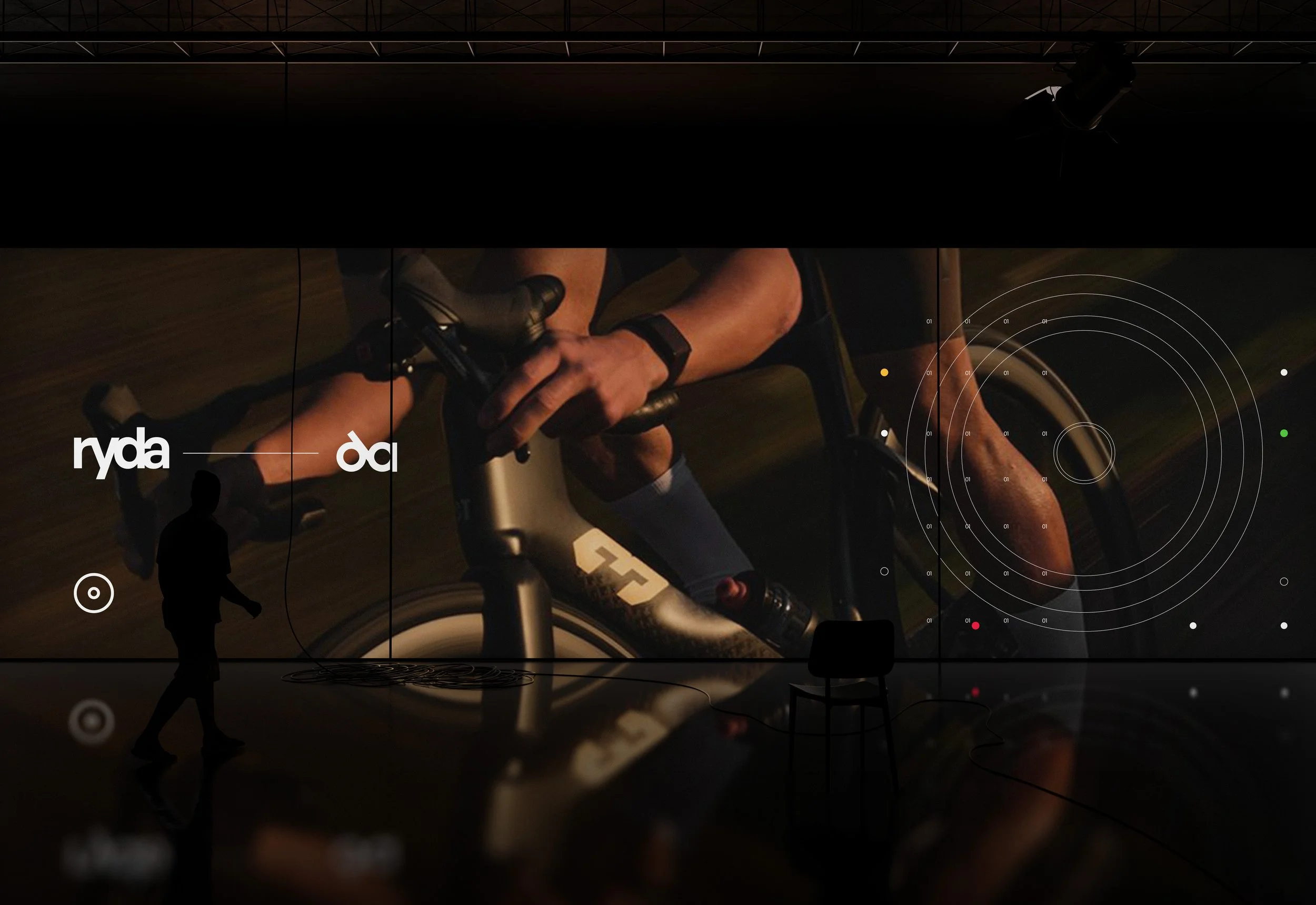
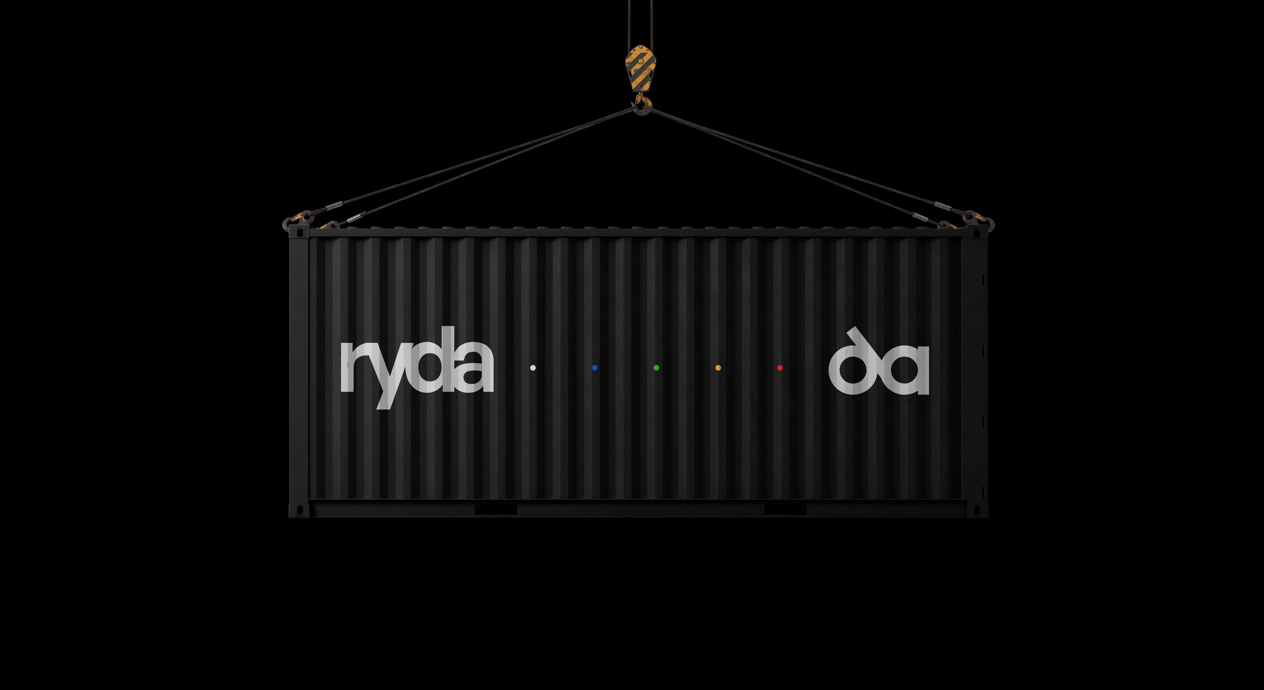
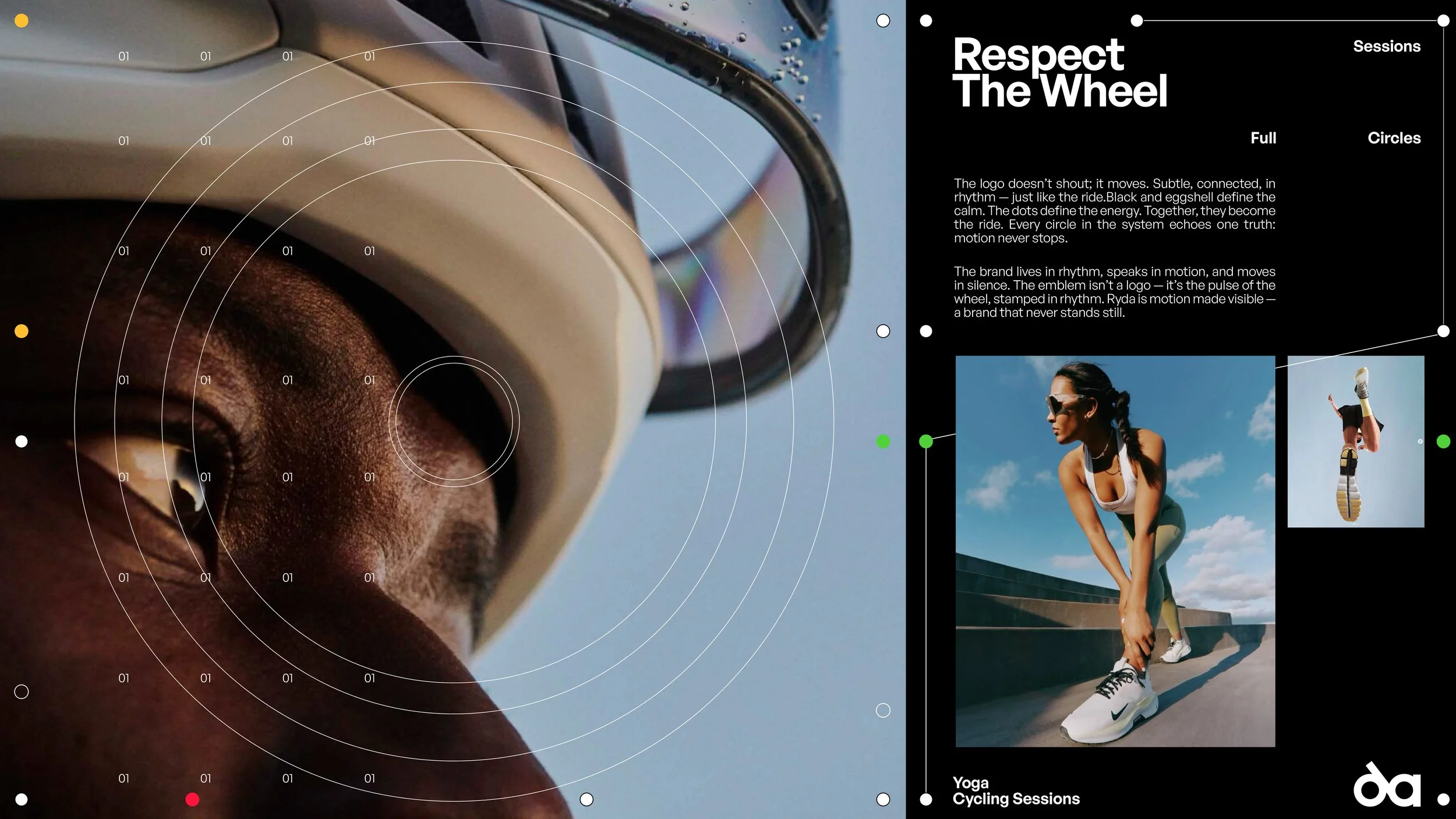
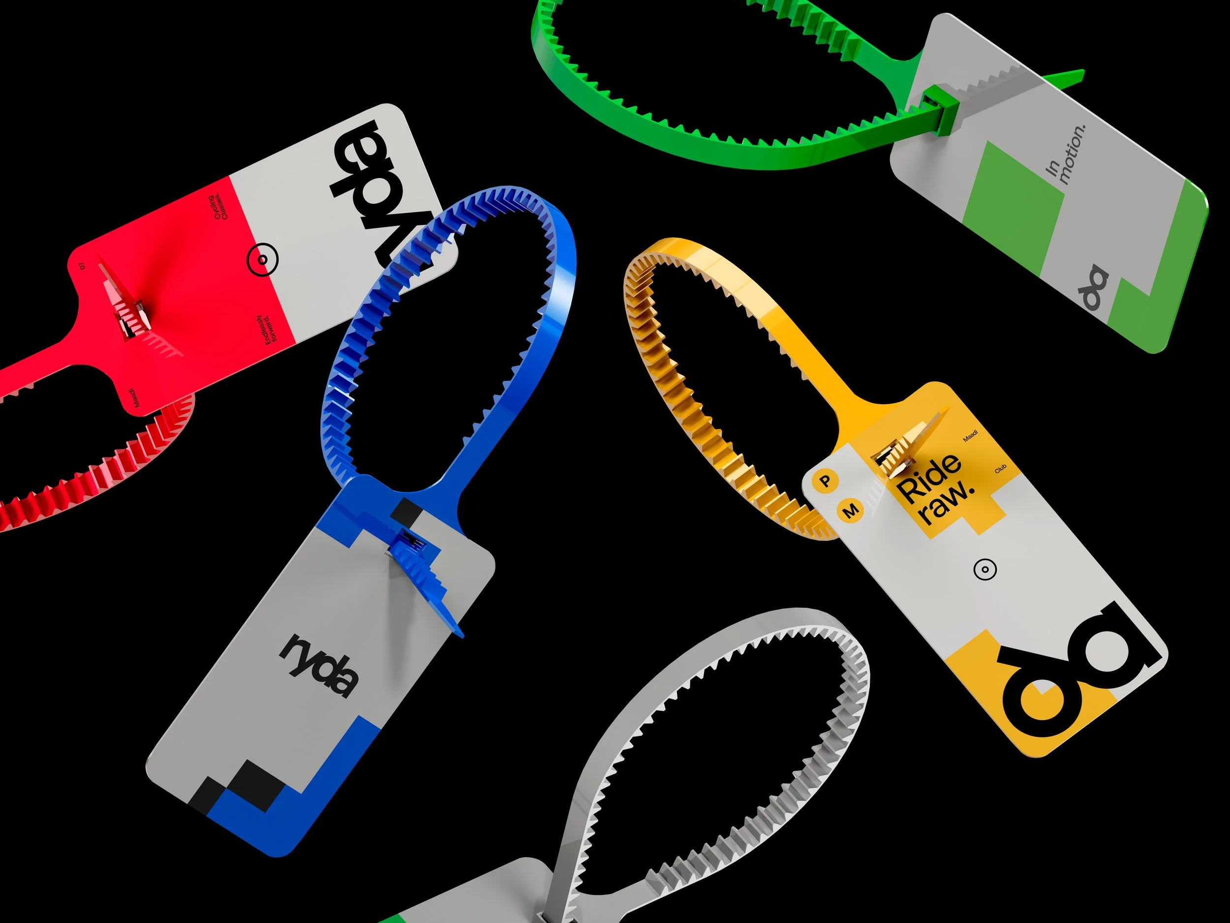
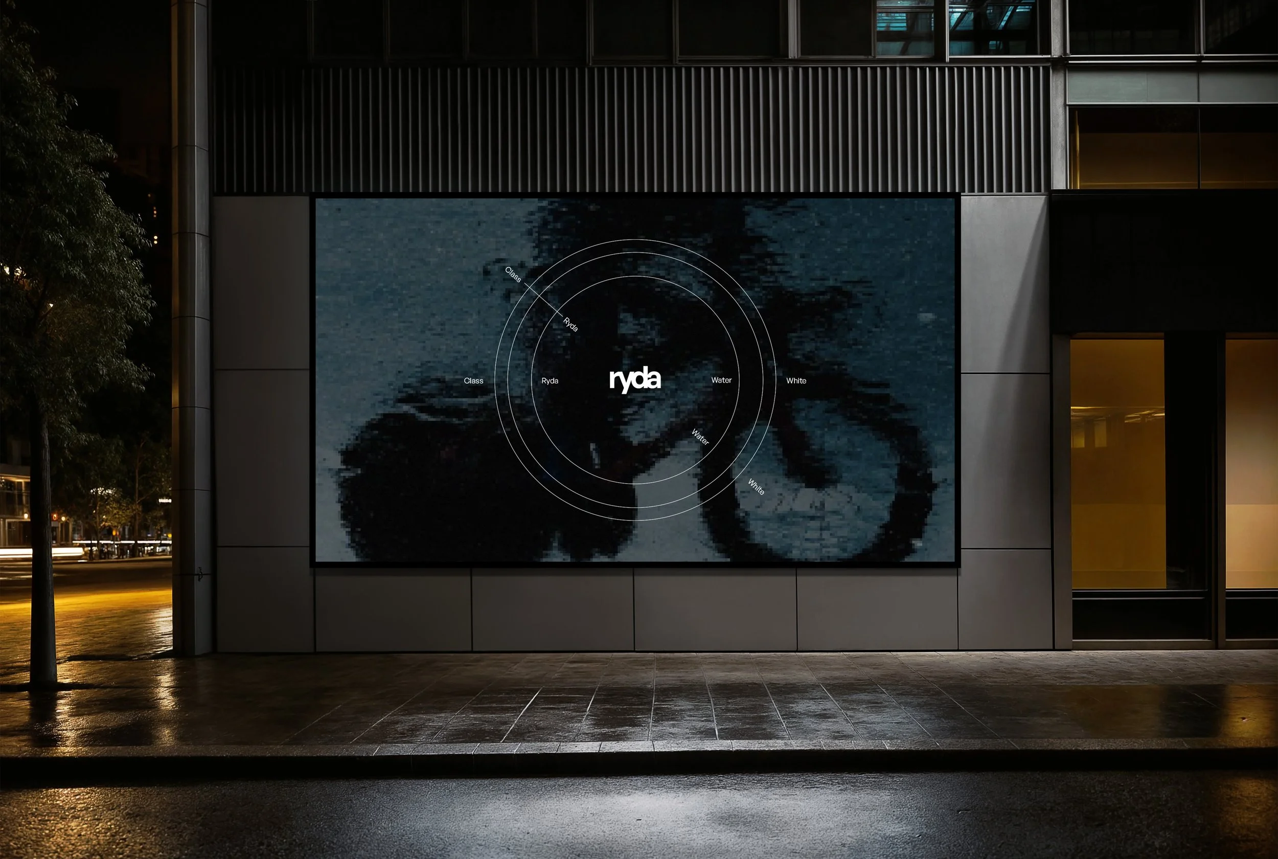
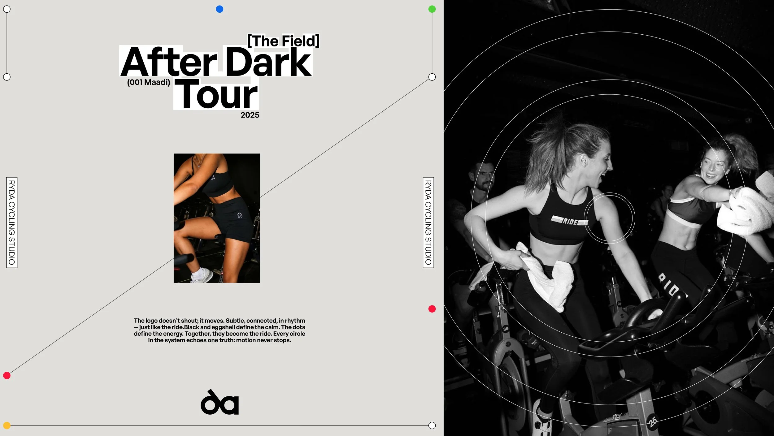
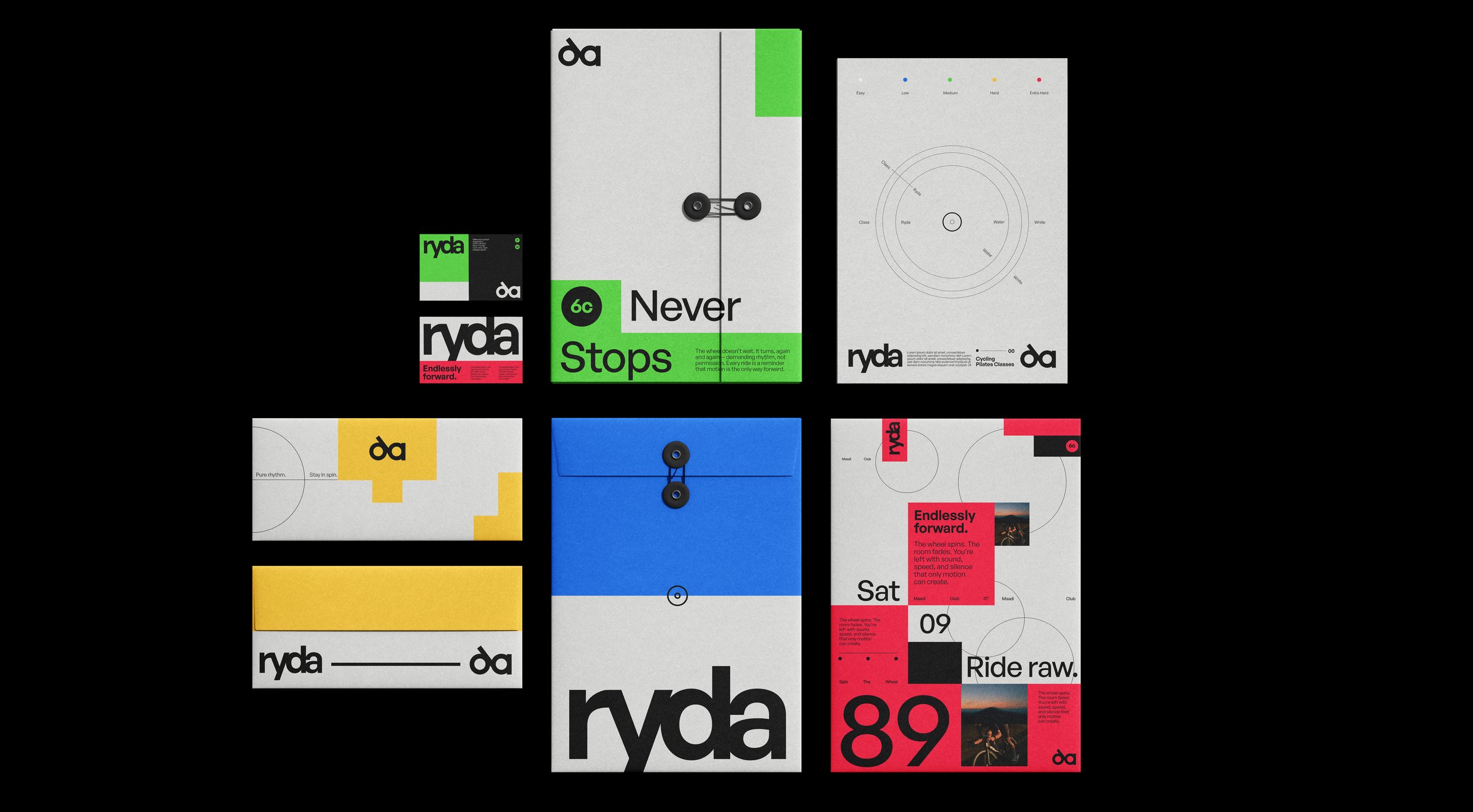
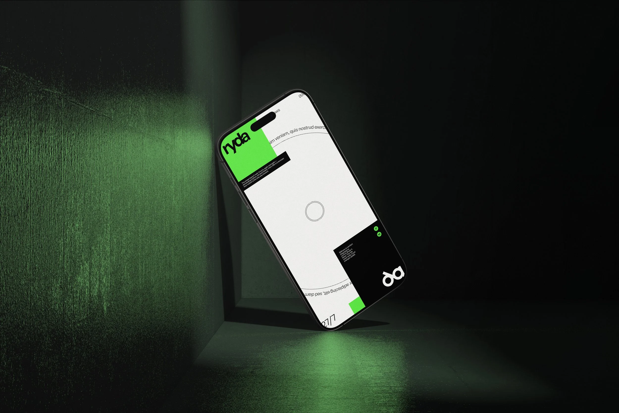
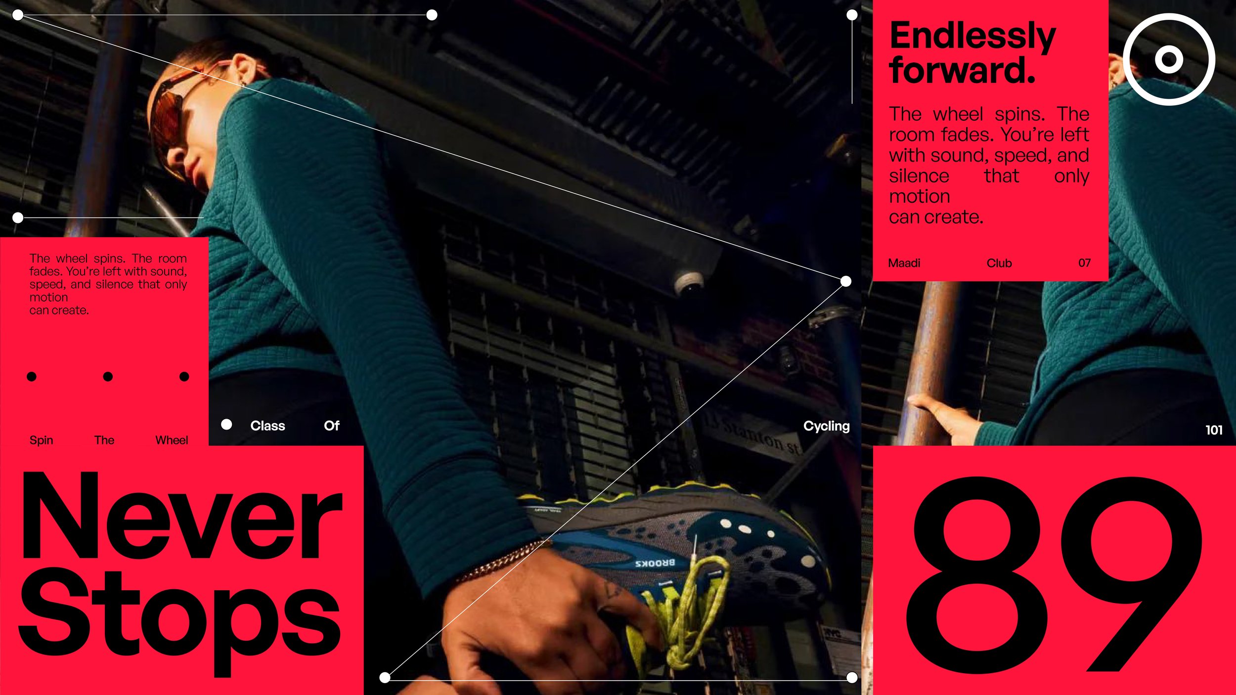
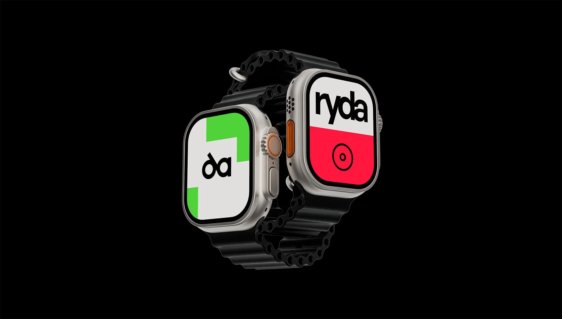
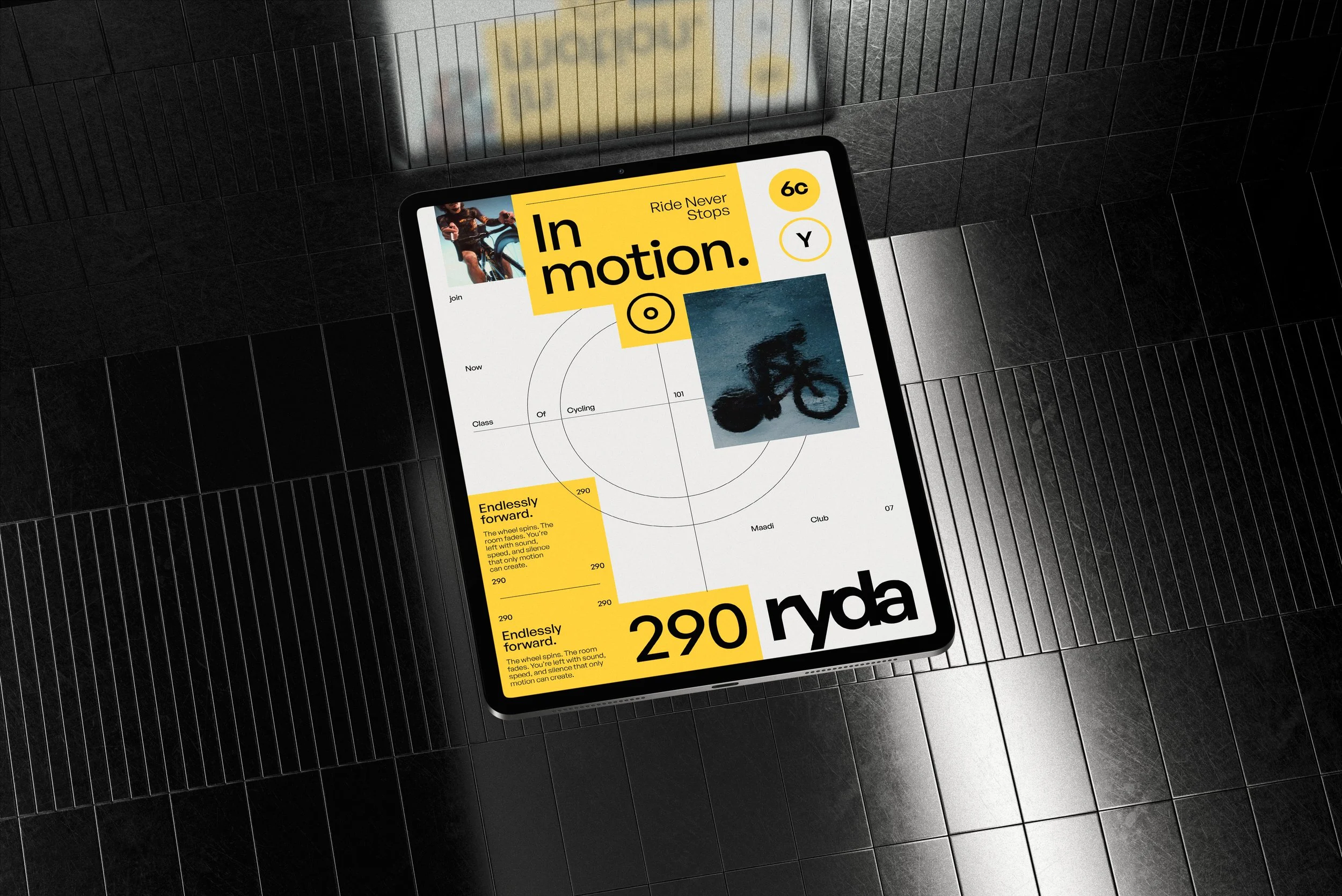
The entire identity is built around circular forms, referencing the core of cycling. Thin lines form cycling-inspired layouts, while the emblem, a simplified wheel, anchors the system. The wordmark is clean, minimal, and slightly futuristic, paired with a secondary icon that subtly resembles a bike while maintaining typographic harmony. The color palette is dominated by black and eggshell, with minimal accents of white and small circular touches of yellow, green, blue, and red, each representing a cycling level. To create visual contrast and depth, square layouts are introduced when highlighting individual colors or elements, symbolizing elevation and progress. Thin lines and precise dots throughout the system reinforce a technical, sleek, and modern mood.
Results
Ryda’s branding embodies motion through simplicity, an identity that feels fast, precise, and elevated. It seamlessly blends athletic energy with design sophistication, making it instantly recognizable and conceptually aligned with the spirit of cycling.