Myrk
From Darkness to Light
Intro
Myrk is a property-flipping brand built on transformation—turning neglected spaces into premium, desirable homes. The name Myrk, meaning darkness, became the foundation for a visual identity that symbolizes the journey from dark to light, aligning perfectly with the brand’s purpose.
Strategy
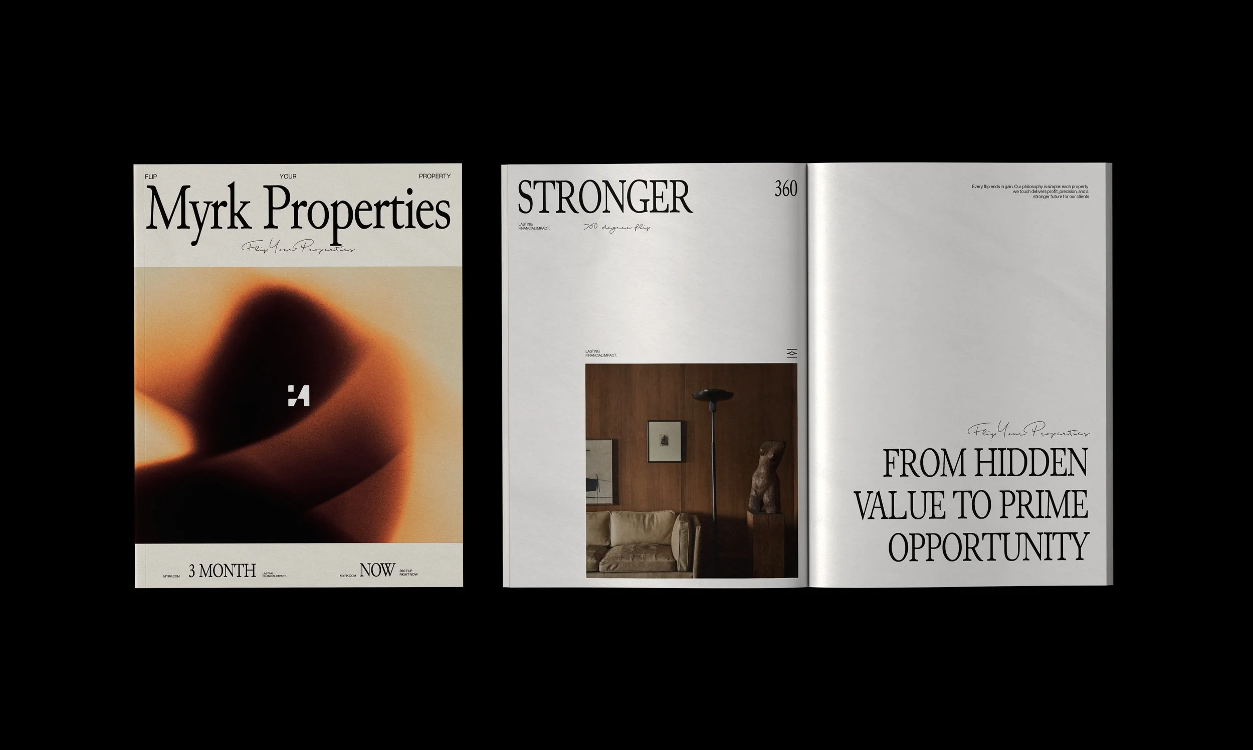
The strategy centers on contrast—capturing the essence of transformation. The brand narrative moves from darkness before renovation to brightness after flipping, emphasizing growth, renewal, and elevated living. Myrk positions itself as the brand that finds hidden potential in every space and turns it into something extraordinary.
Design
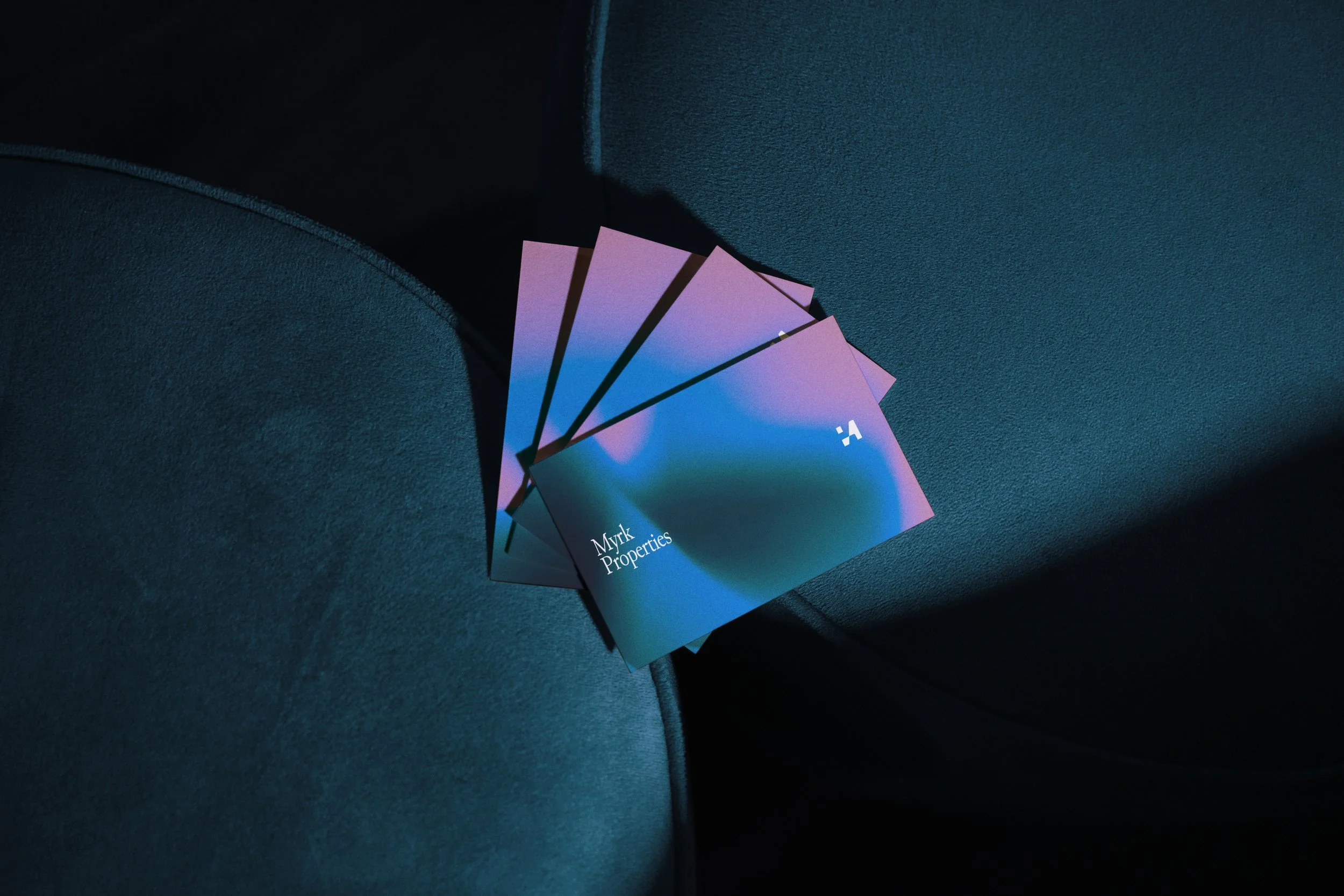
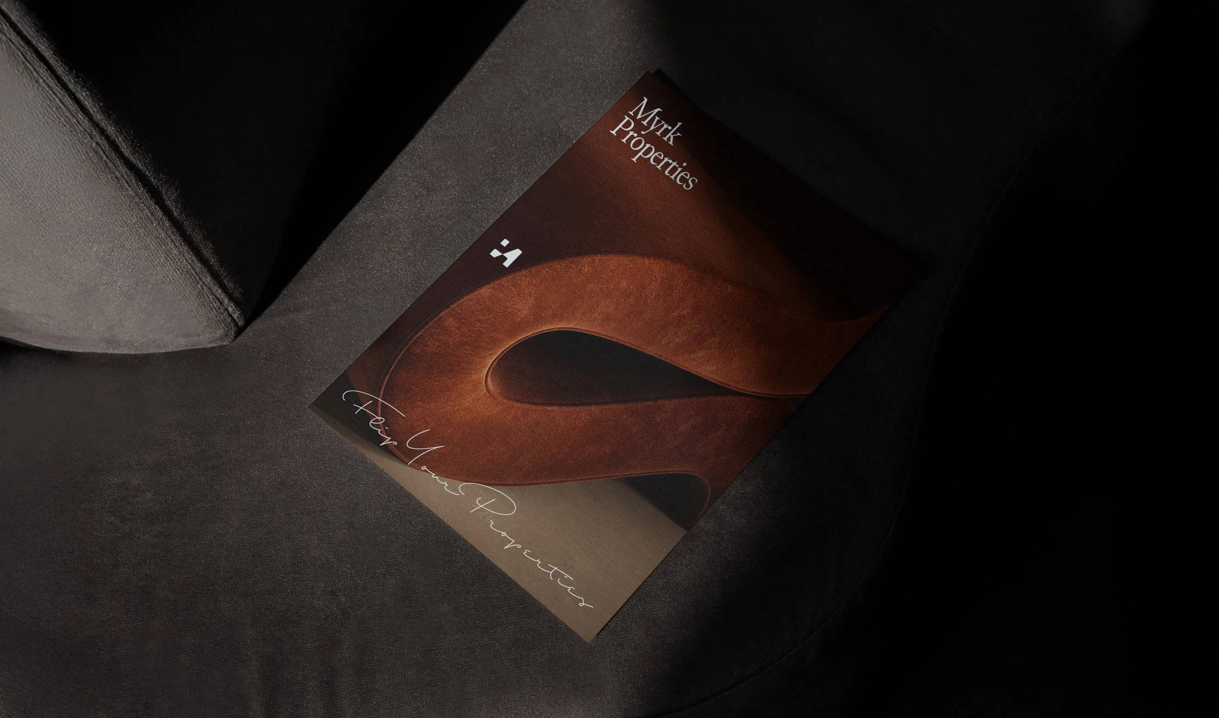
The logo uses an elegant serif typeface—refined, minimal, and timeless. Its emblem, an abstract M, is crafted to resemble both a top-view of a unit and a sculptural letterform, blending architectural precision with a sense of exclusivity. The visual system revolves around gradients that shift between dark and light hues, representing the brand’s core idea of transformation. These gradients are endlessly adaptable, blending seamlessly with imagery and layouts to create a flexible yet premium aesthetic.
Results
Myrk’s identity redefines real estate branding through symbolism and sophistication. It delivers a visual experience that communicates change, contrast, and class—mirroring the brand’s purpose of turning overlooked properties into bright, elevated investments.


